Branding & Identity Guidelines
for the Inclusive Design Archive
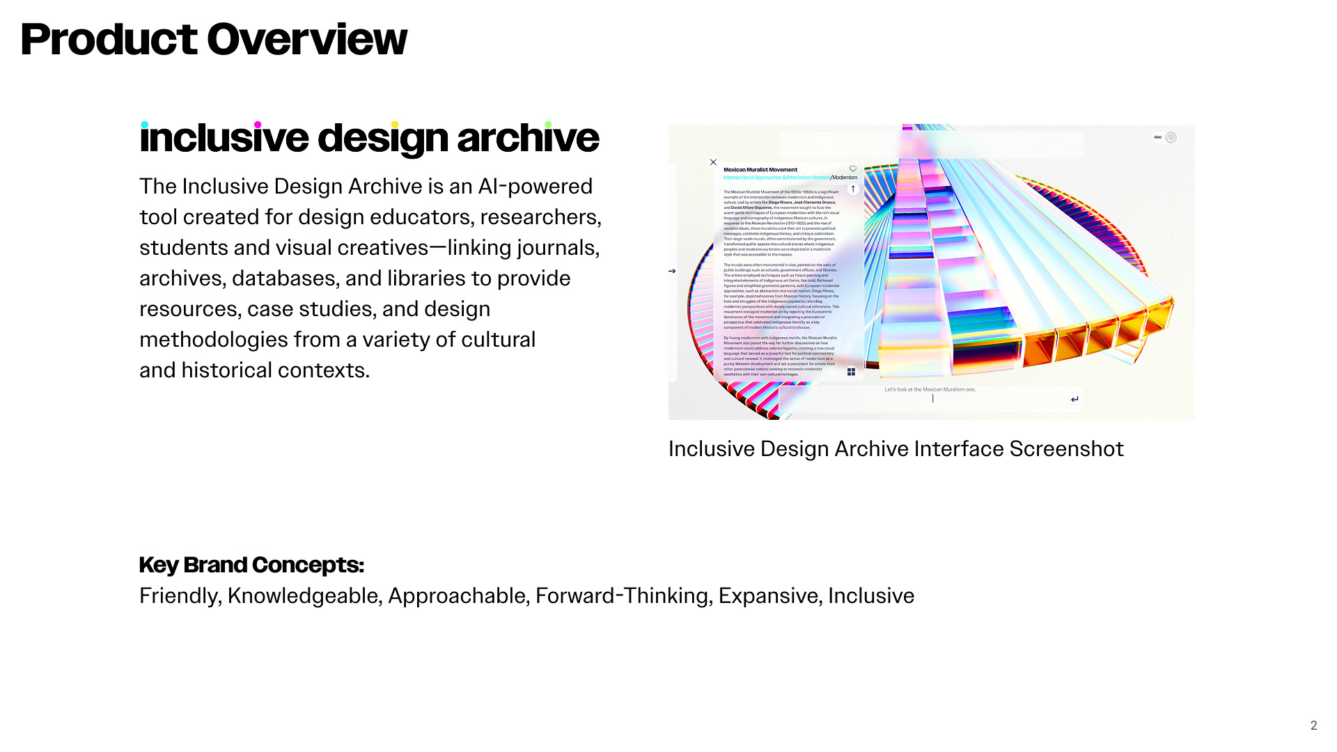
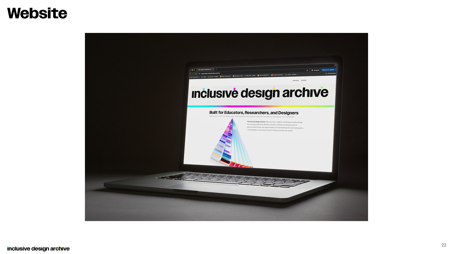
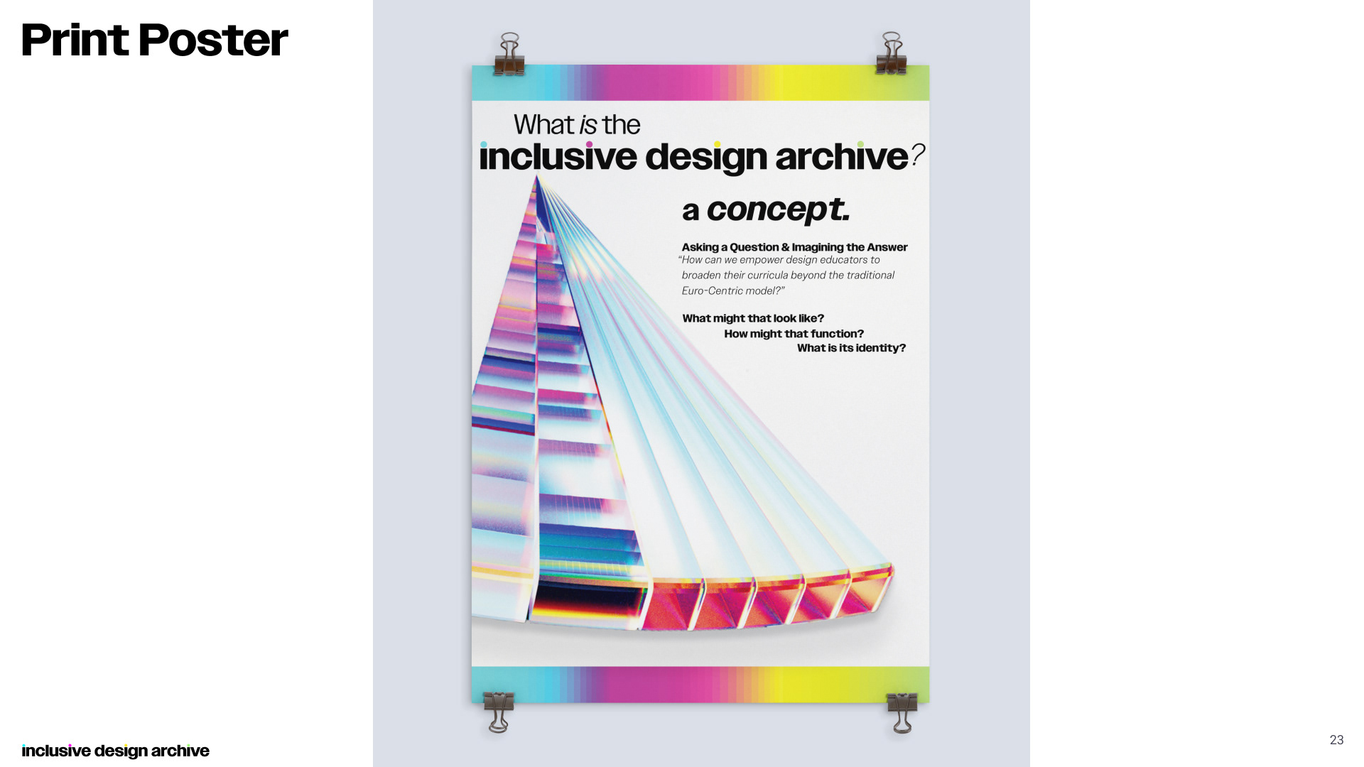
The Inclusive Design Archive (Ida) is a conceptual tool created for design educators, researchers, students and visual creatives—it focuses the analytical power of A.I. to link journals, archives, databases, and libraries; providing resources, case studies, and design methodologies from a variety of cultural and historical contexts.
This system aims to incorporate both the values and the visuals of the product, creating an engaging and approachable identity.
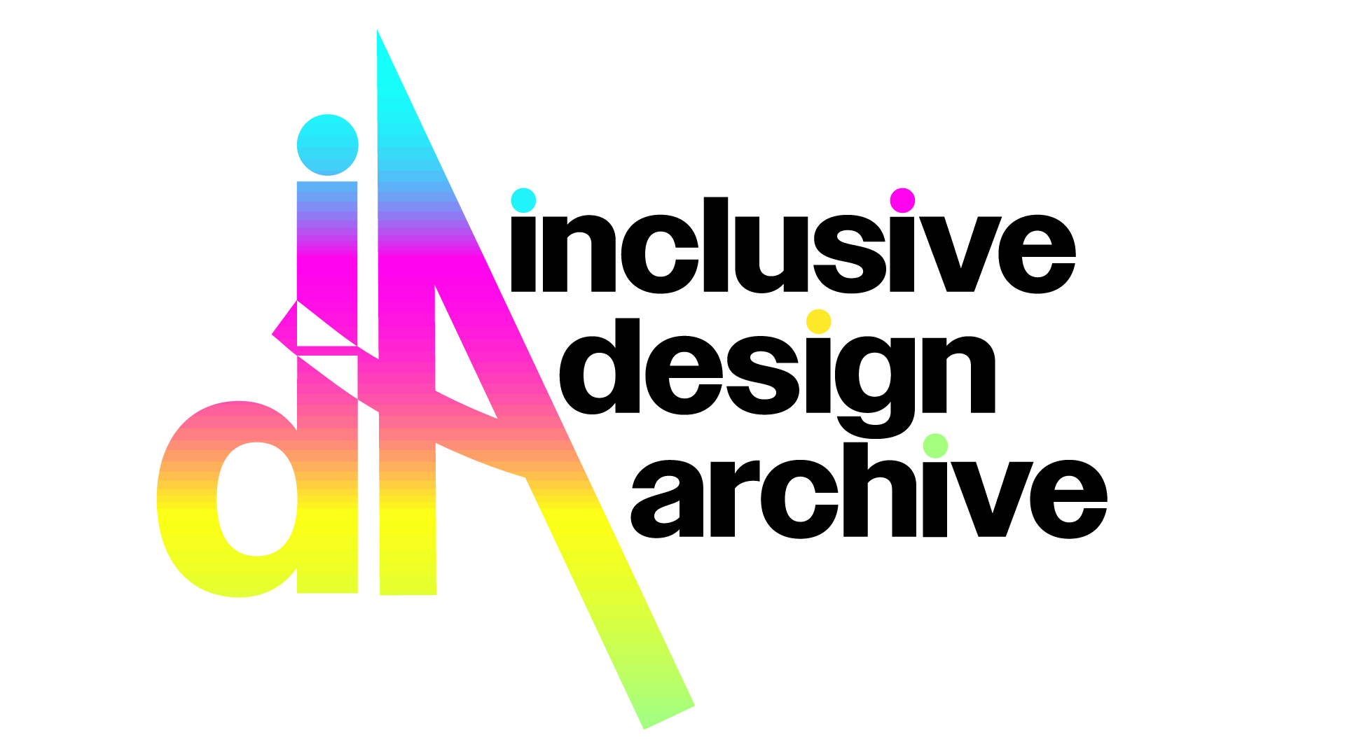
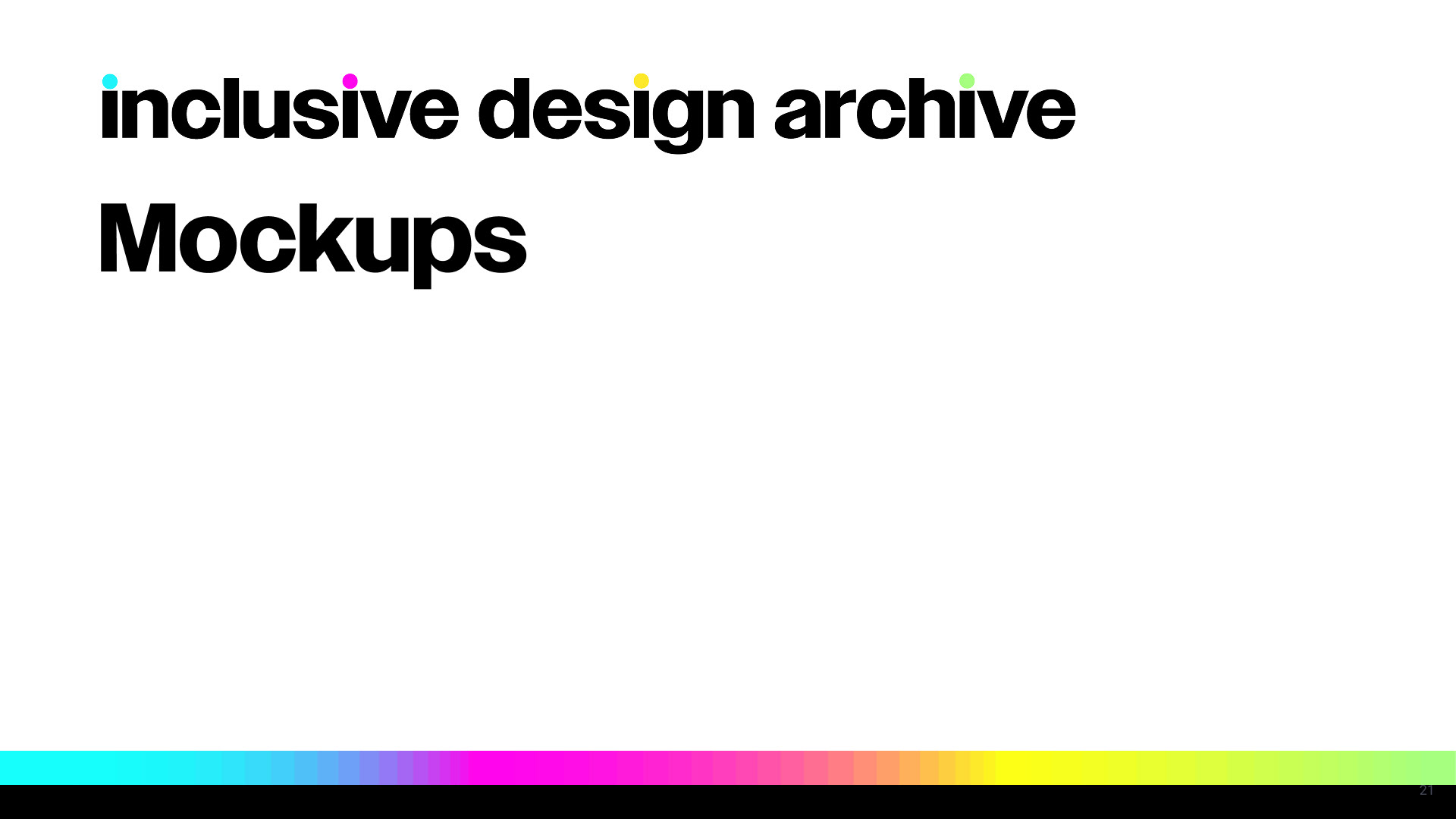
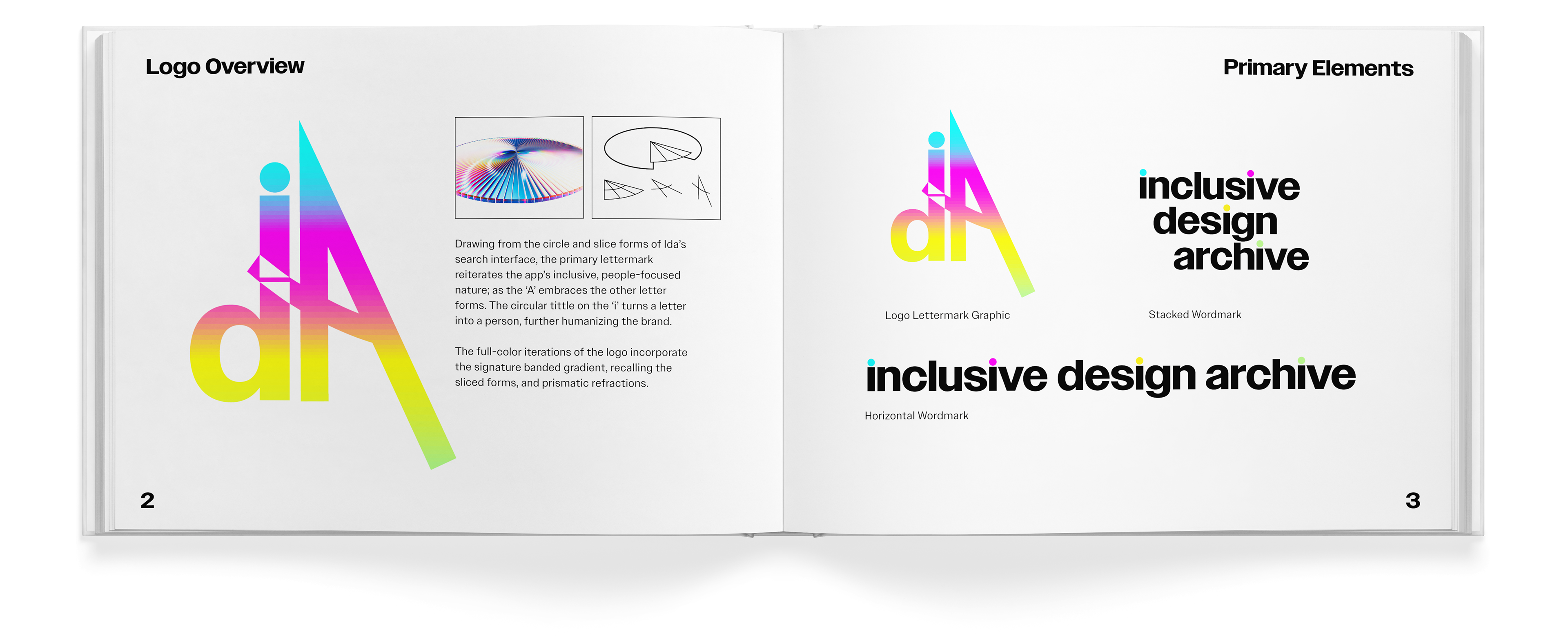
Logo
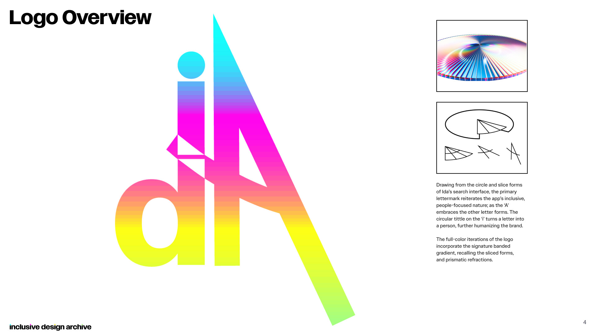
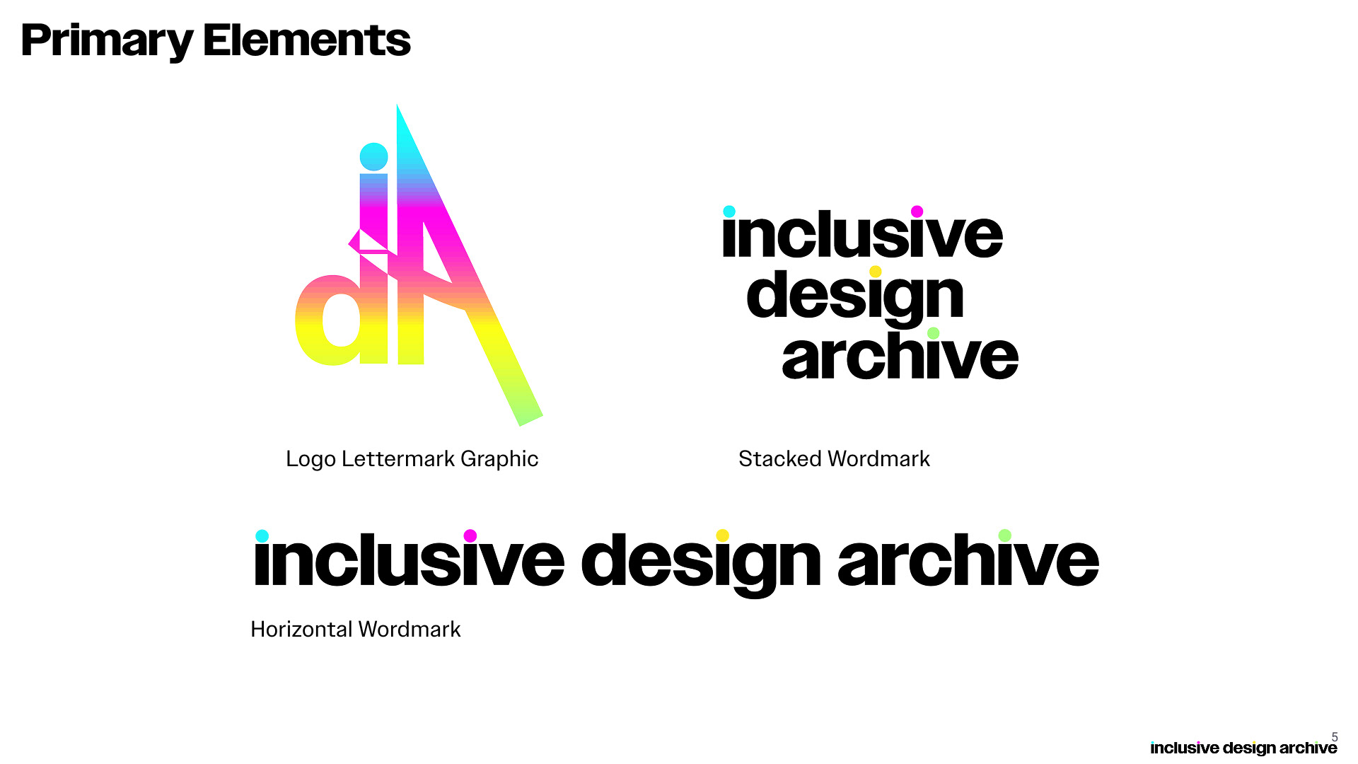
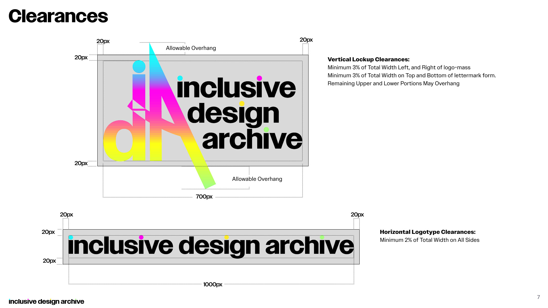
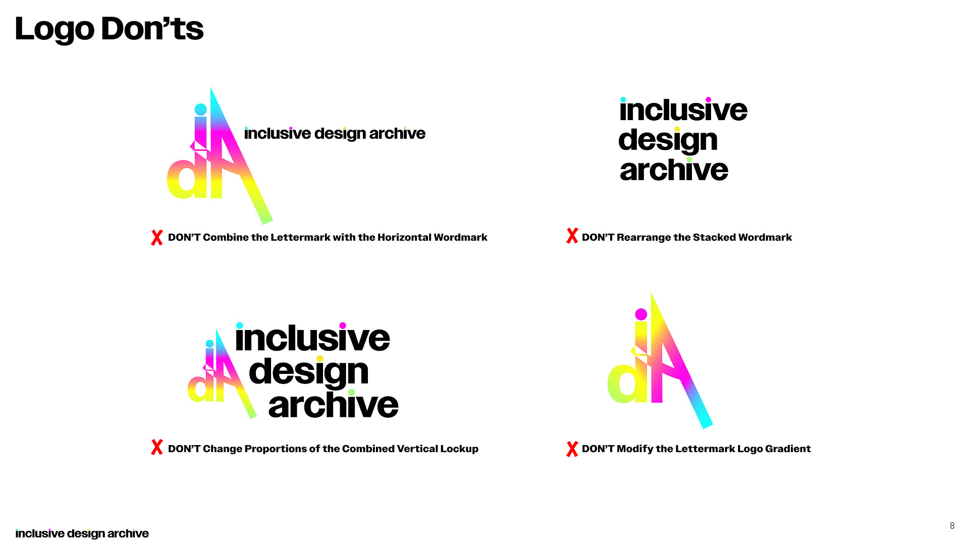
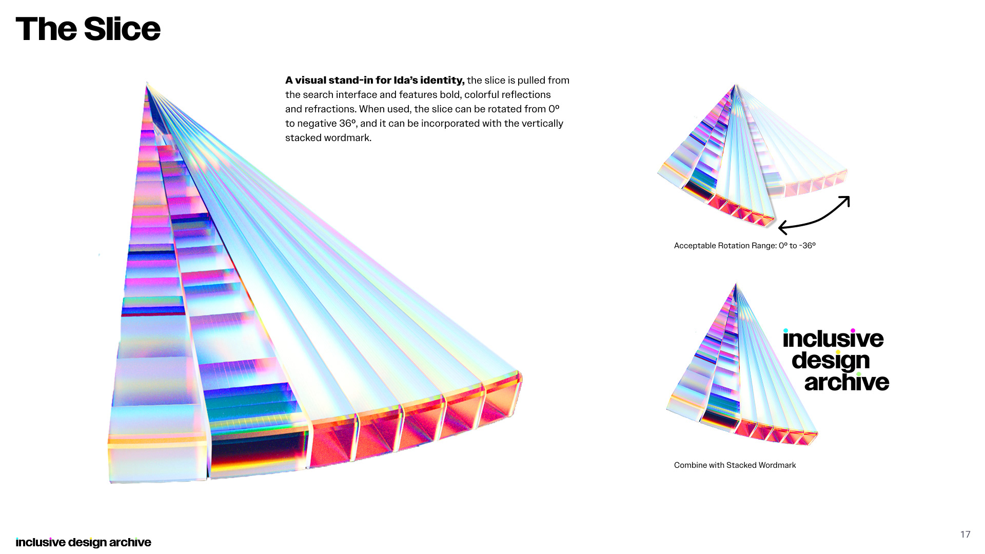
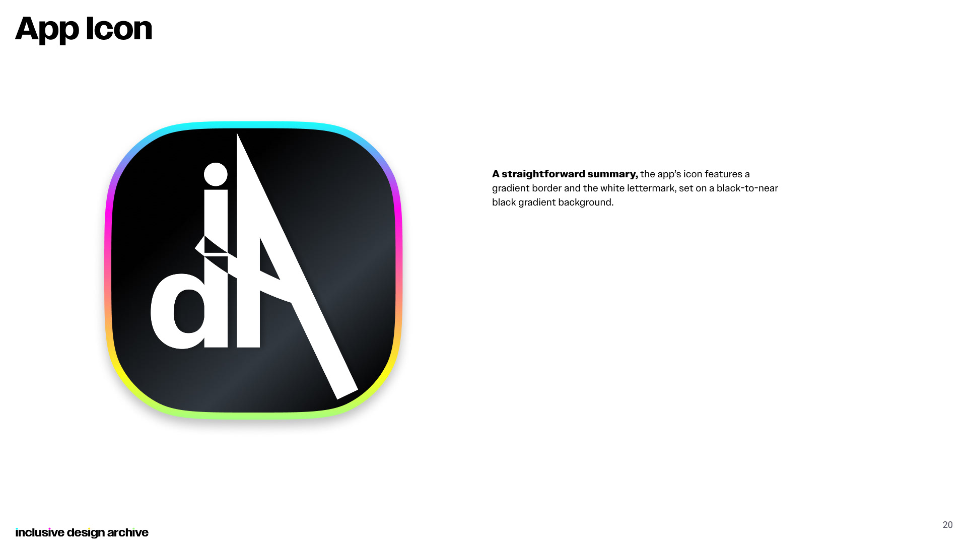
Drawing from the circle and slice forms of Ida’s search interface, the primary lettermark reiterates the app’s inclusive, people-focused nature; as the ‘A’ embraces the other letter forms. The circular tittle on the ‘i’ turns a letter into a person, further humanizing the brand.
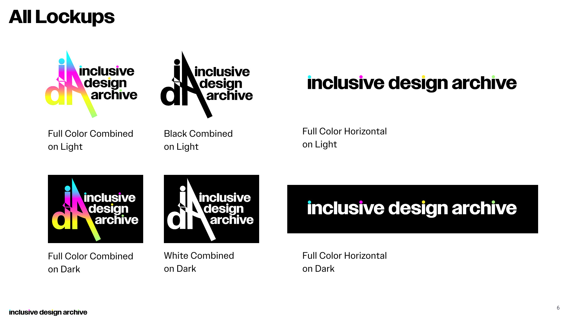
The full-color iterations of the logo incorporate the signature banded gradient, recalling the sliced forms, and prismatic refractions.
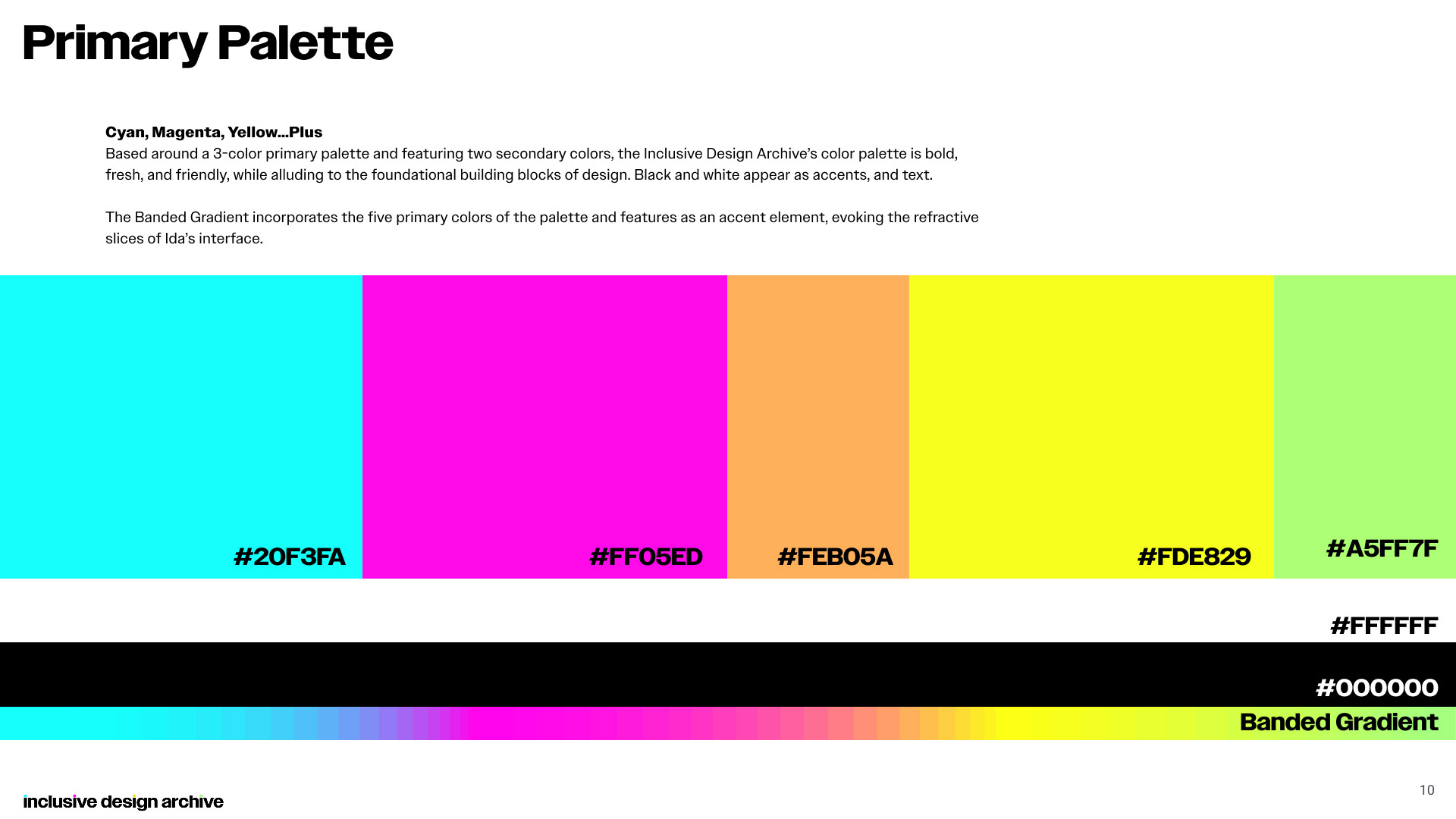
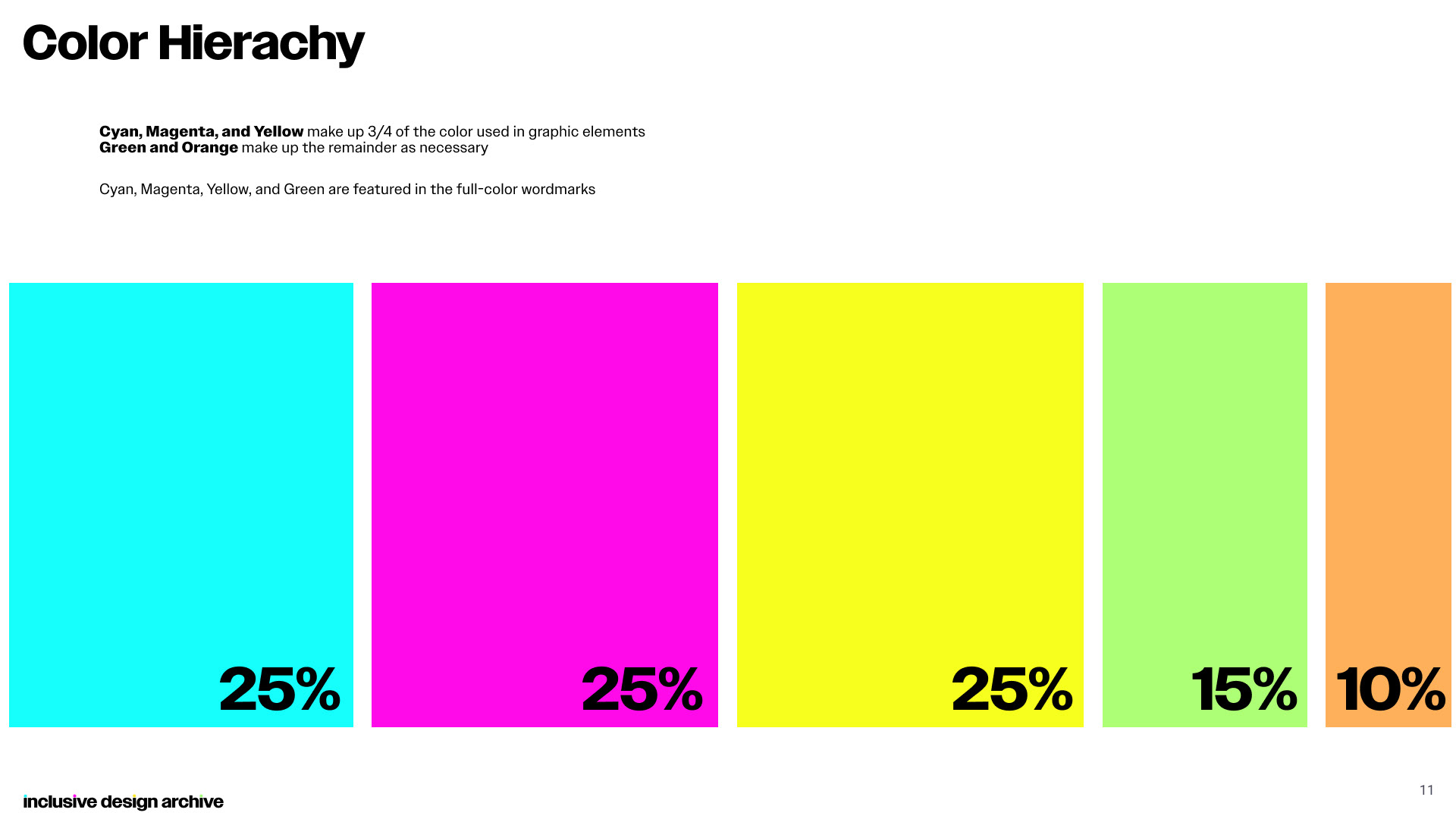
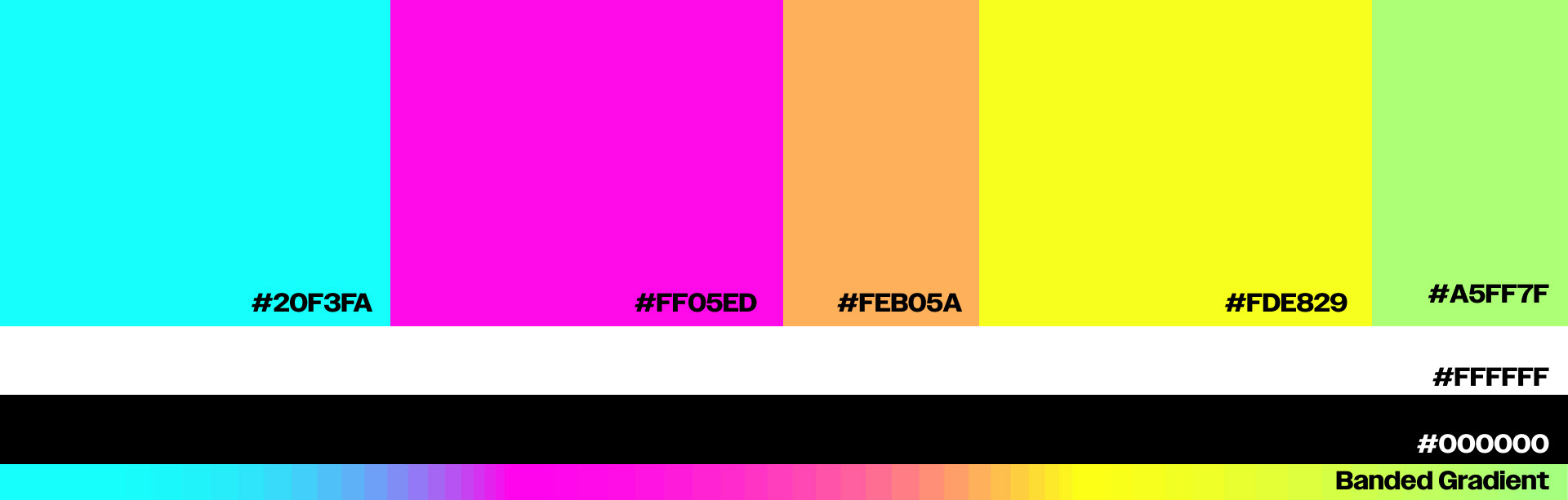
Cyan, Magenta, Yellow...Plus
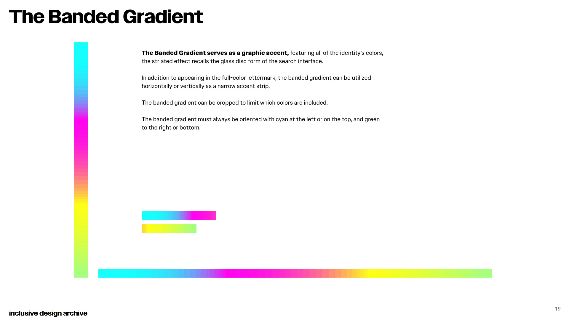
Based around a 3-color primary palette and featuring two secondary colors, the Inclusive Design Archive’s color palette is bold, fresh, and friendly, while alluding to the foundational building blocks of design. Black and white appear as accents, and text.
The Banded Gradient incorporates the five primary colors of the palette and features as an accent element, evoking the refractive slices of Ida’s interface.
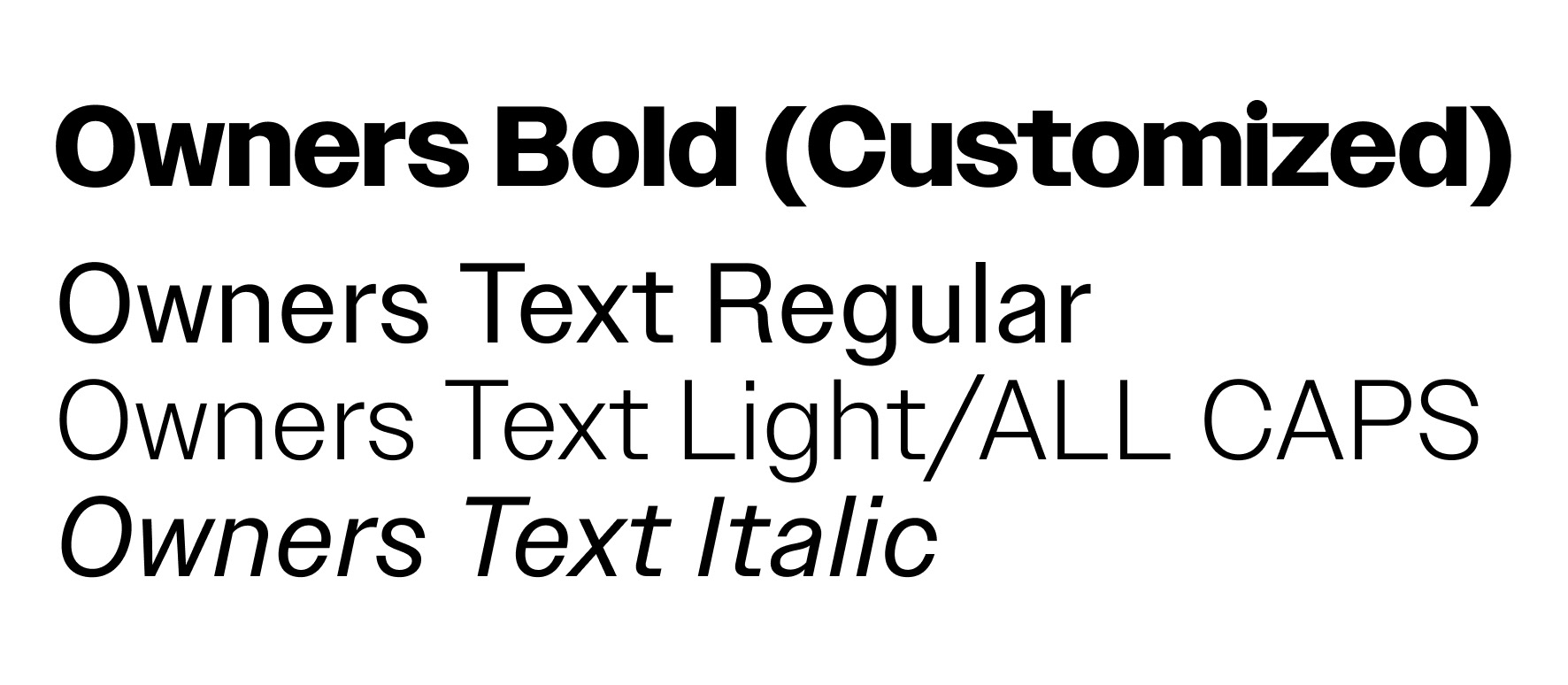
Typography
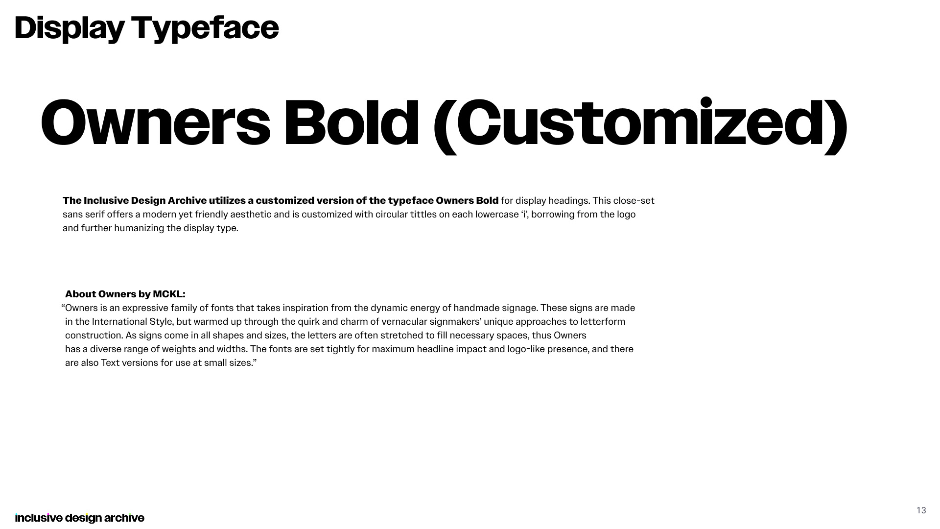
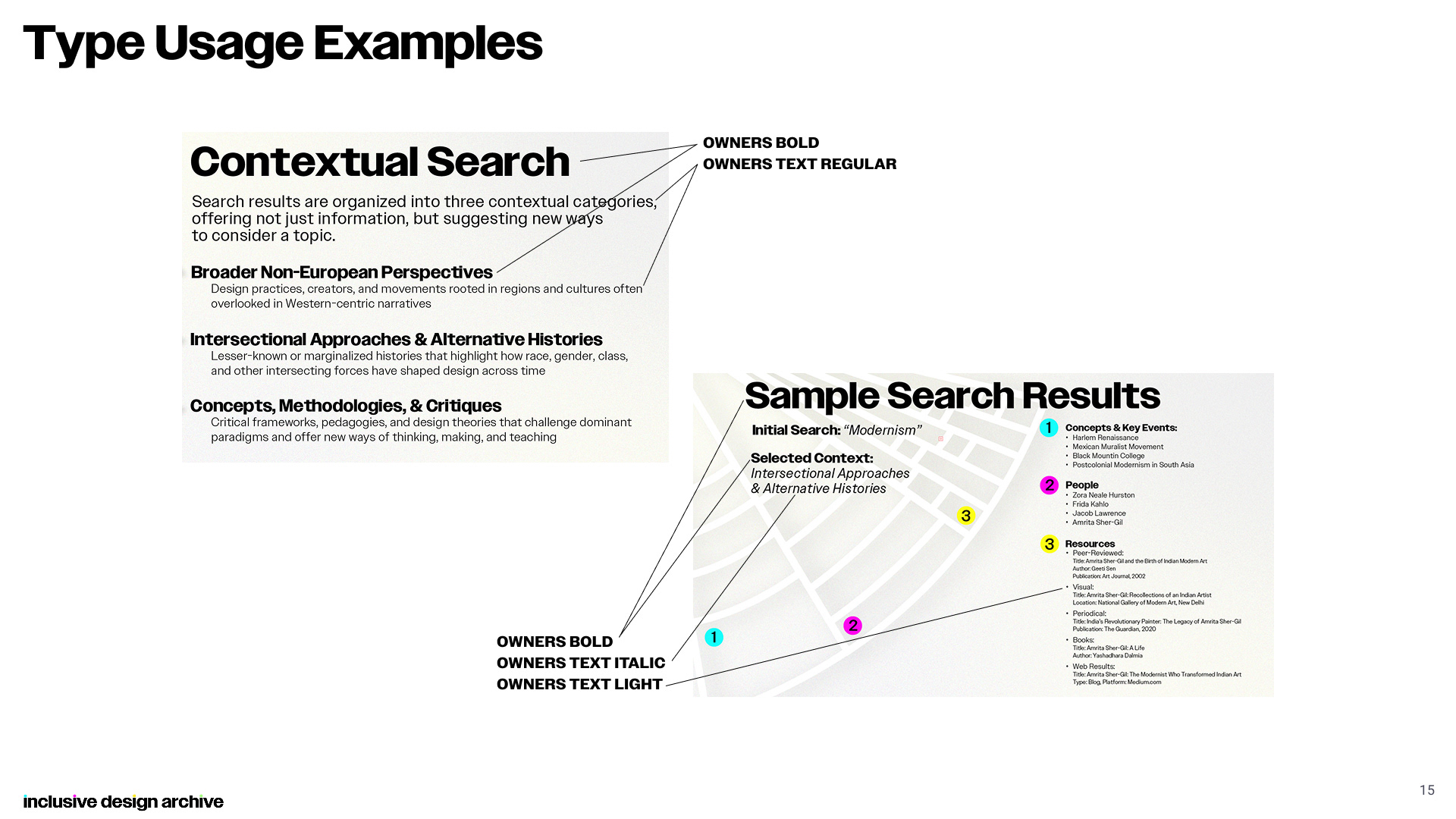
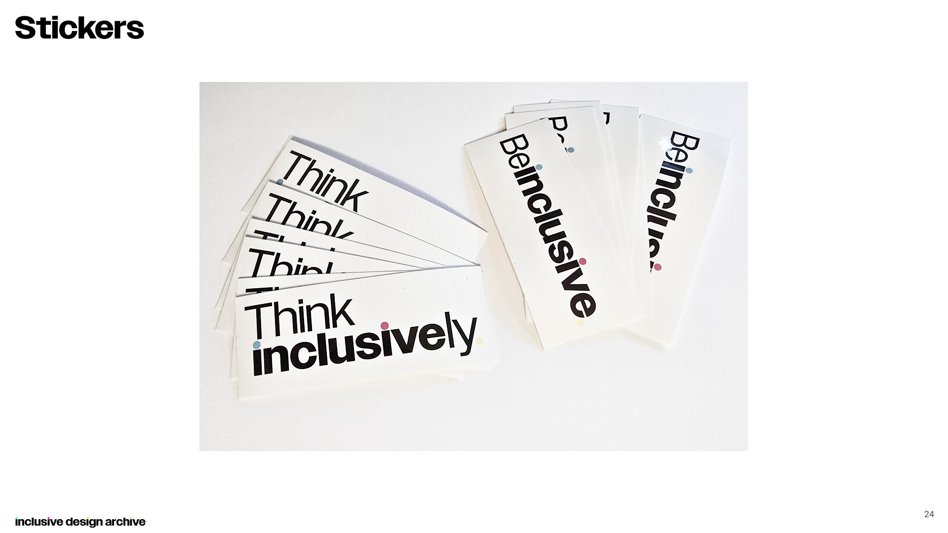
The Inclusive Design Archive utilizes a customized version of the typeface Owners Bold for display headings. This close-set sans serif offers a modern yet friendly aesthetic and is customized with circular tittles on each lowercase ‘i’, borrowing from the logo and further humanizing the display type.
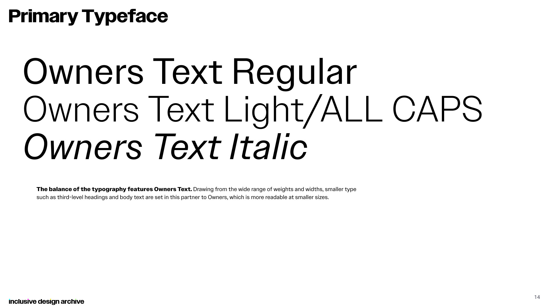
The remainder of the typography features Owners Text. Drawing from the wide range of weights and widths available, smaller type such as third-level headings and body text are set in this partner to Owners, which is more readable at smaller sizes.
View Full Guidelines Document
As a Flip Book:
As an Image Slideshow: