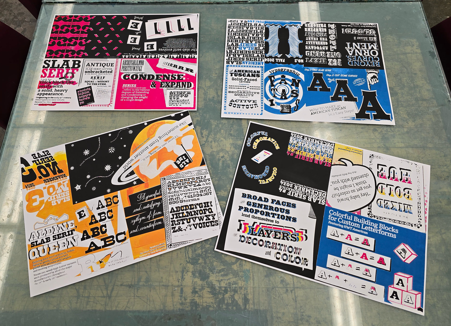
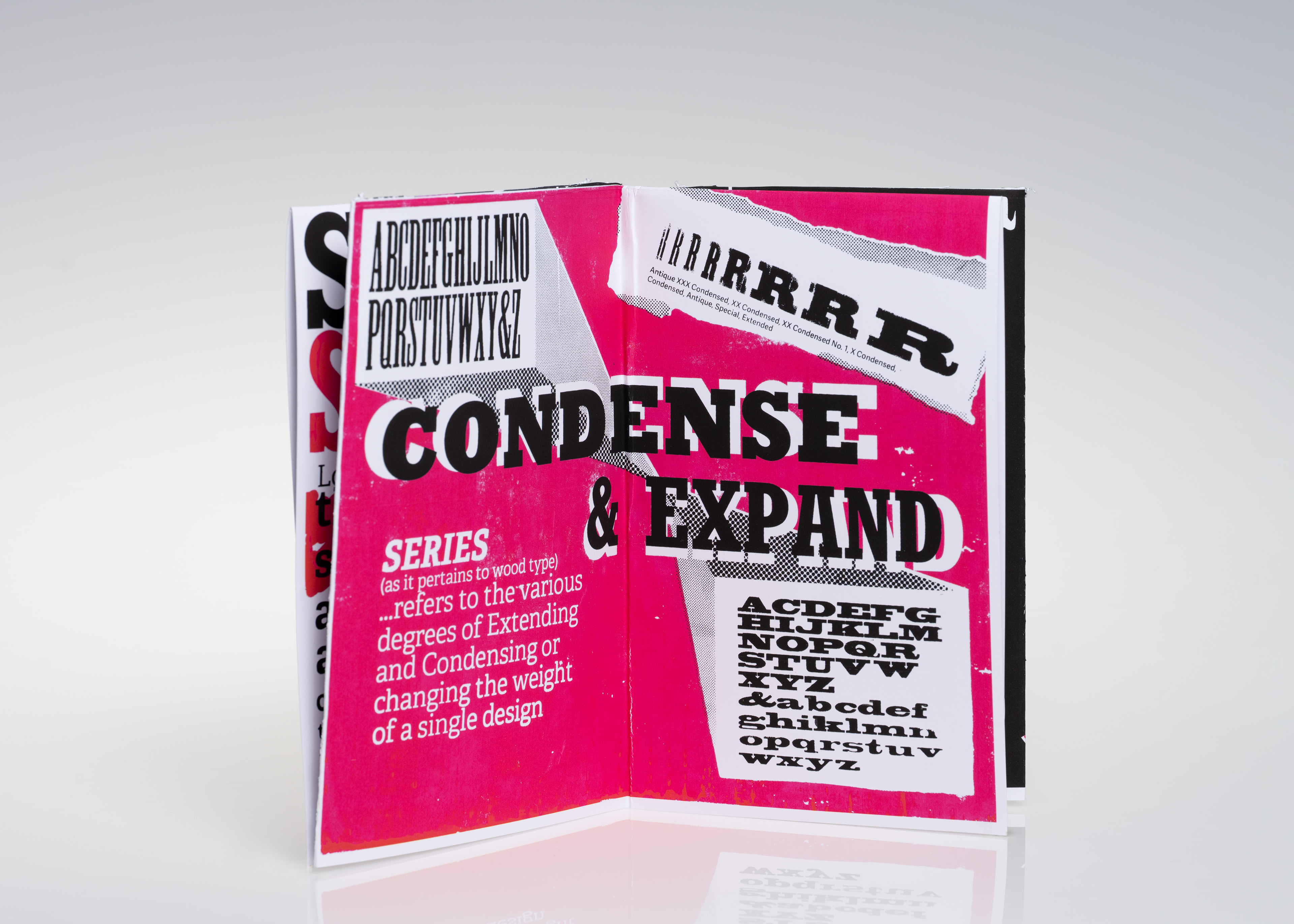
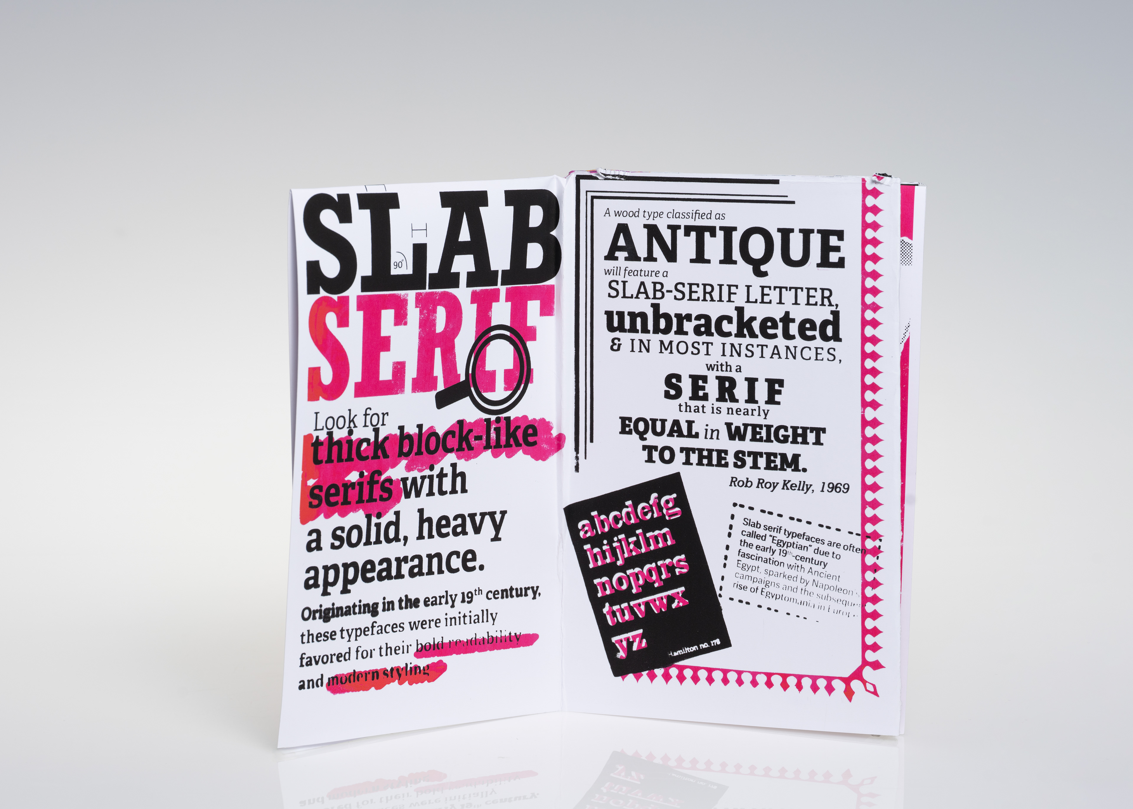
SLAB SERIF, Nos 1-4
A Series of Screen-Printed Zines, Exploring Typographic History and Visual Design
Inspired by the incredible resources of the Cary Collection at R.I.T., this project is an exploration of slab serif typography, the typographic specimen book, and type-as-image; through the media
of screen printing and zines.
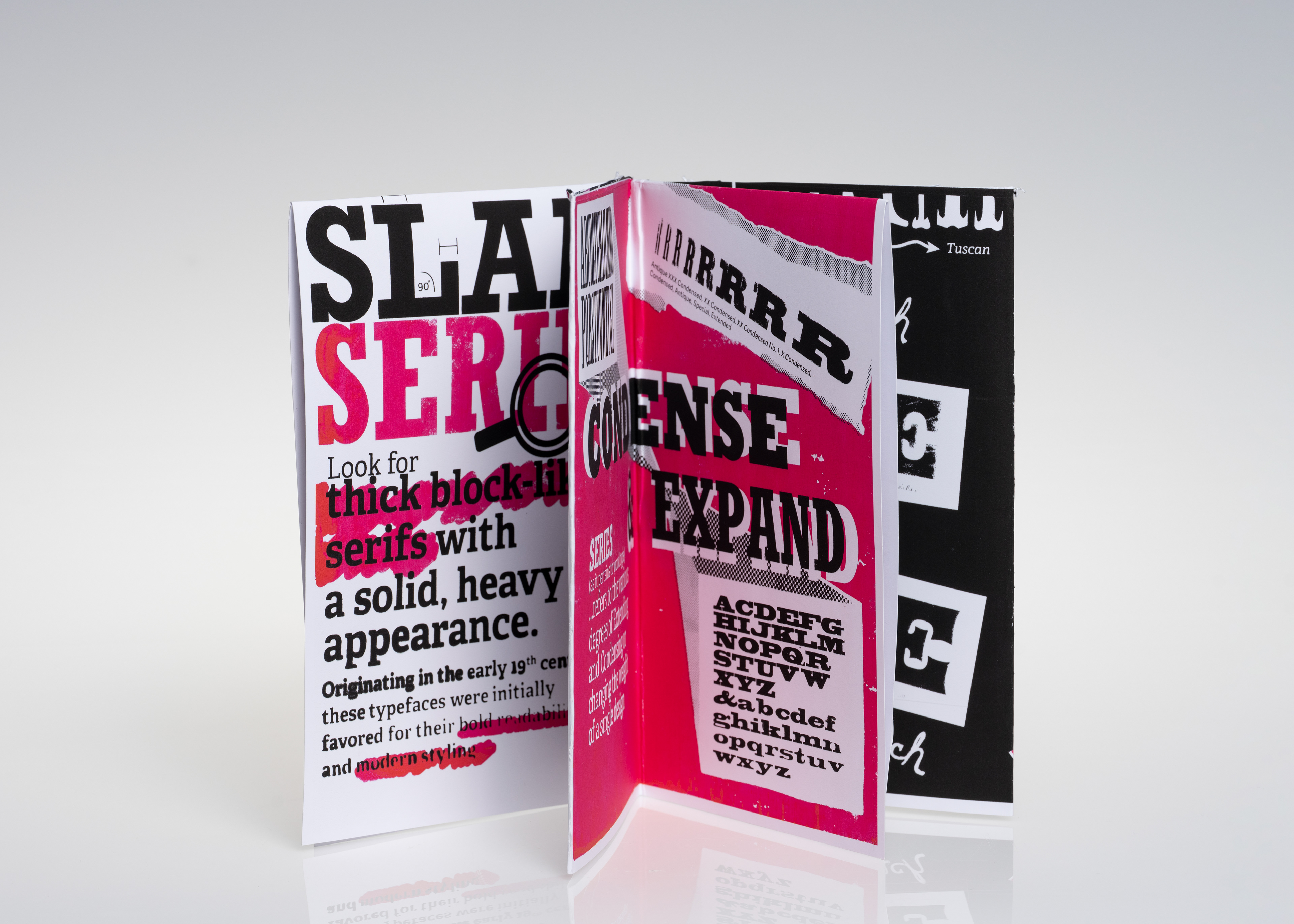
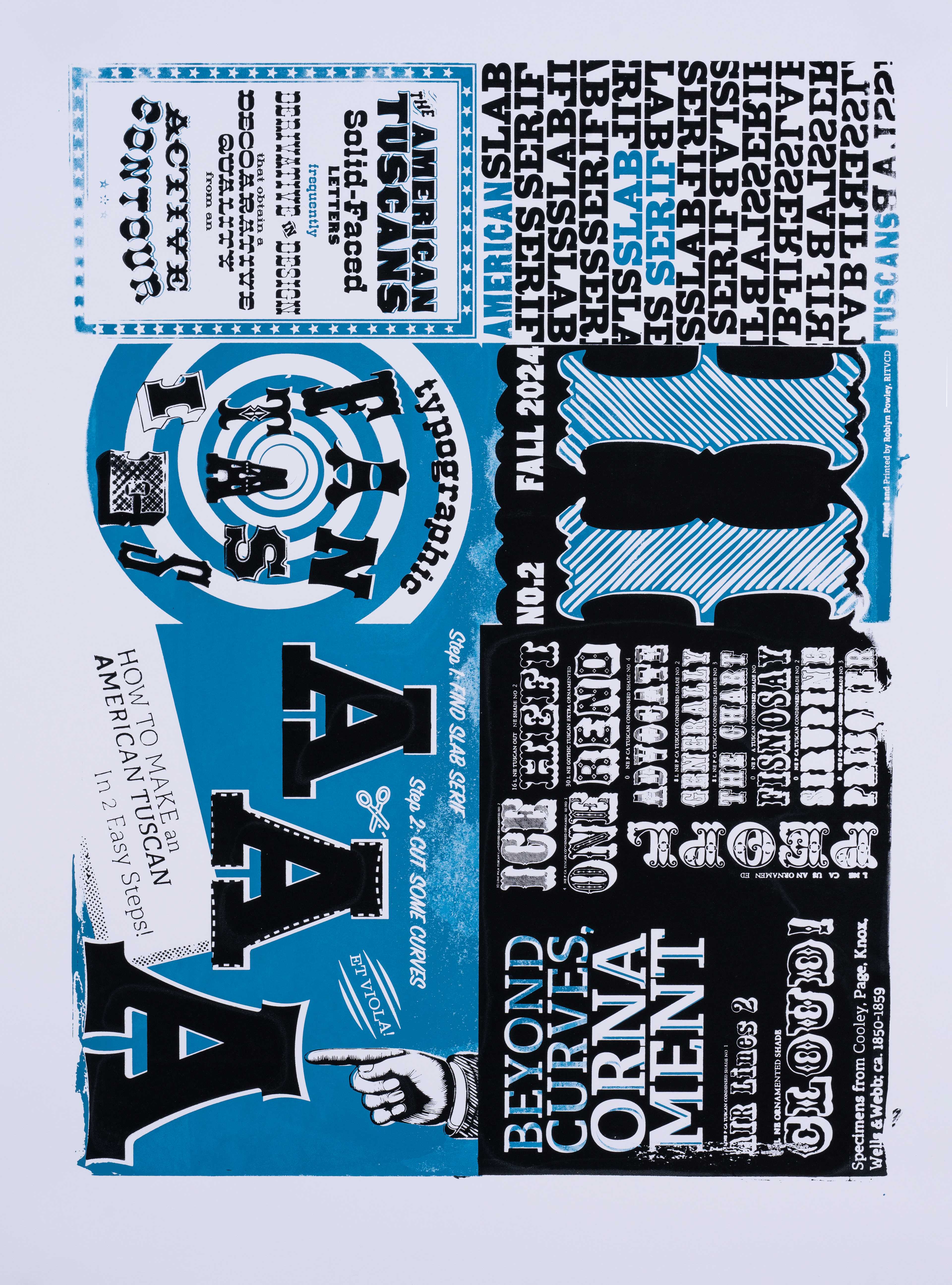
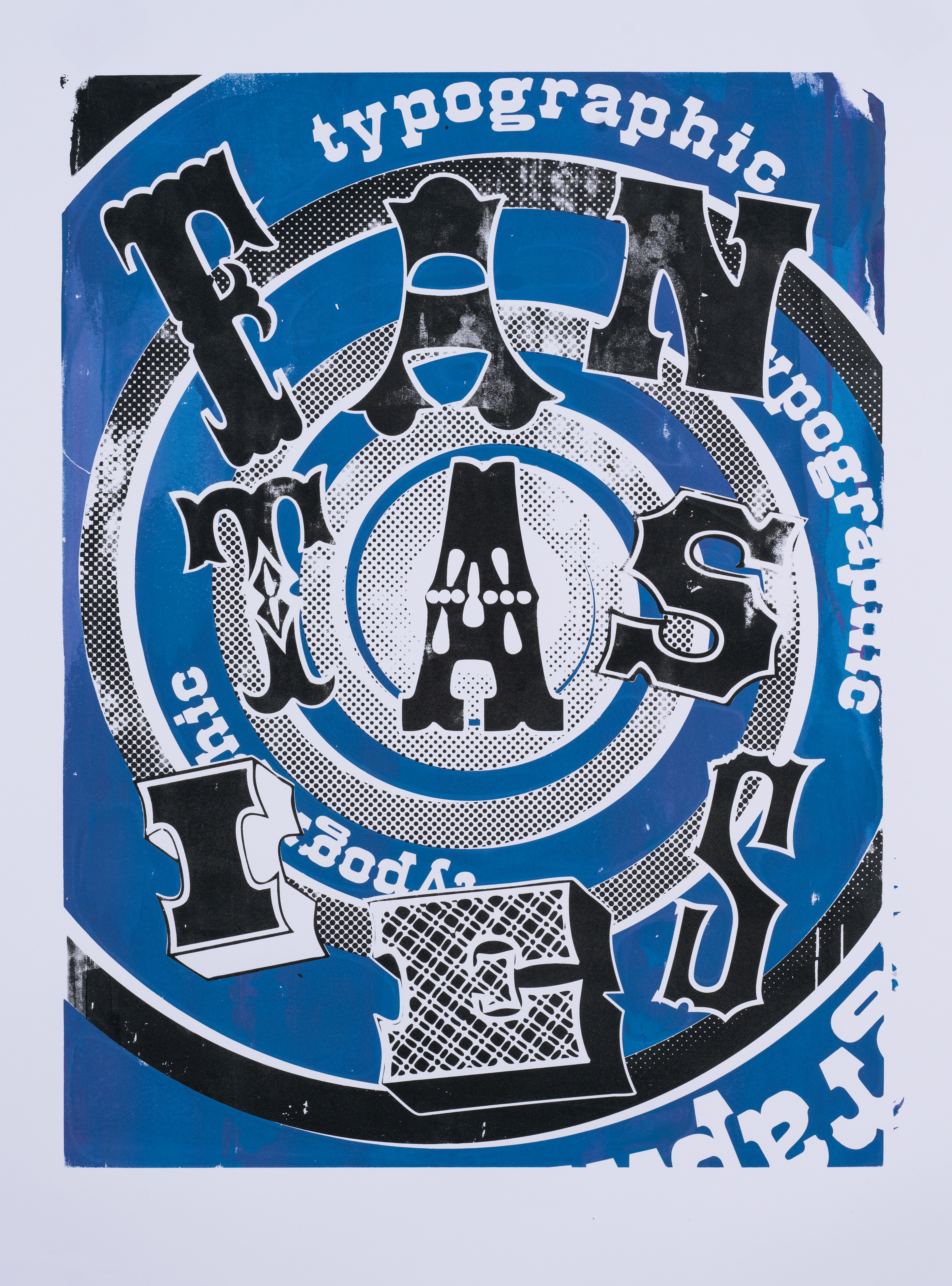
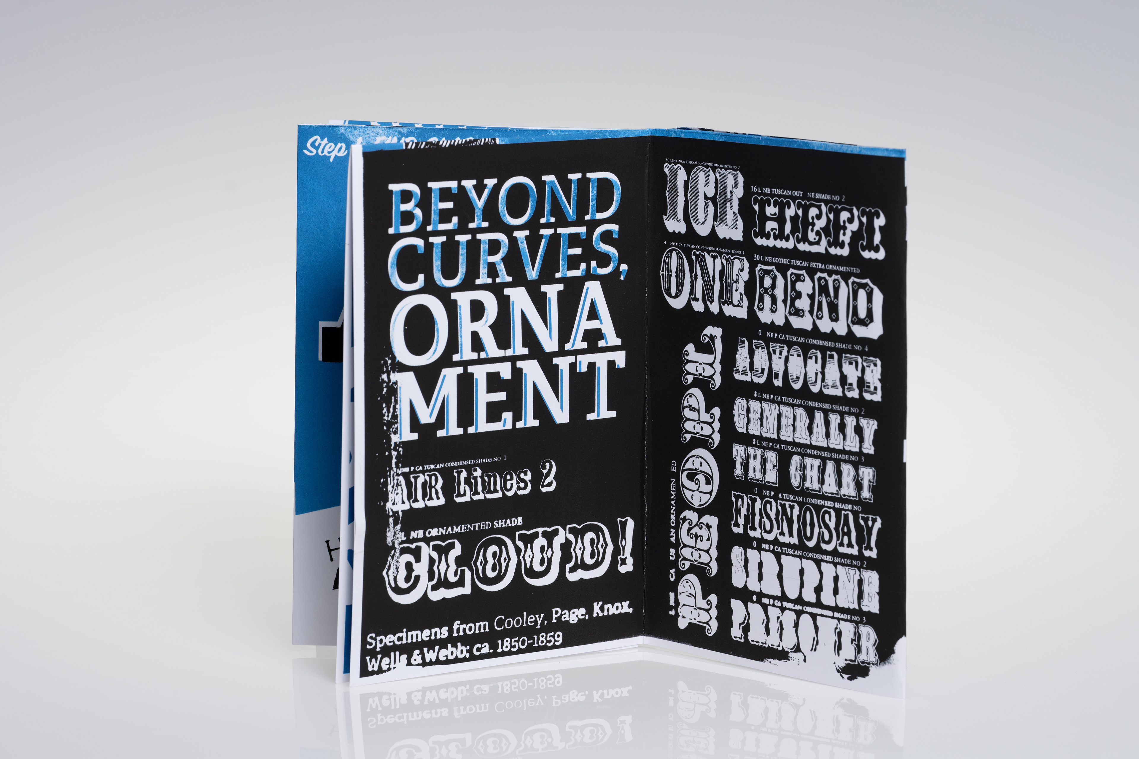
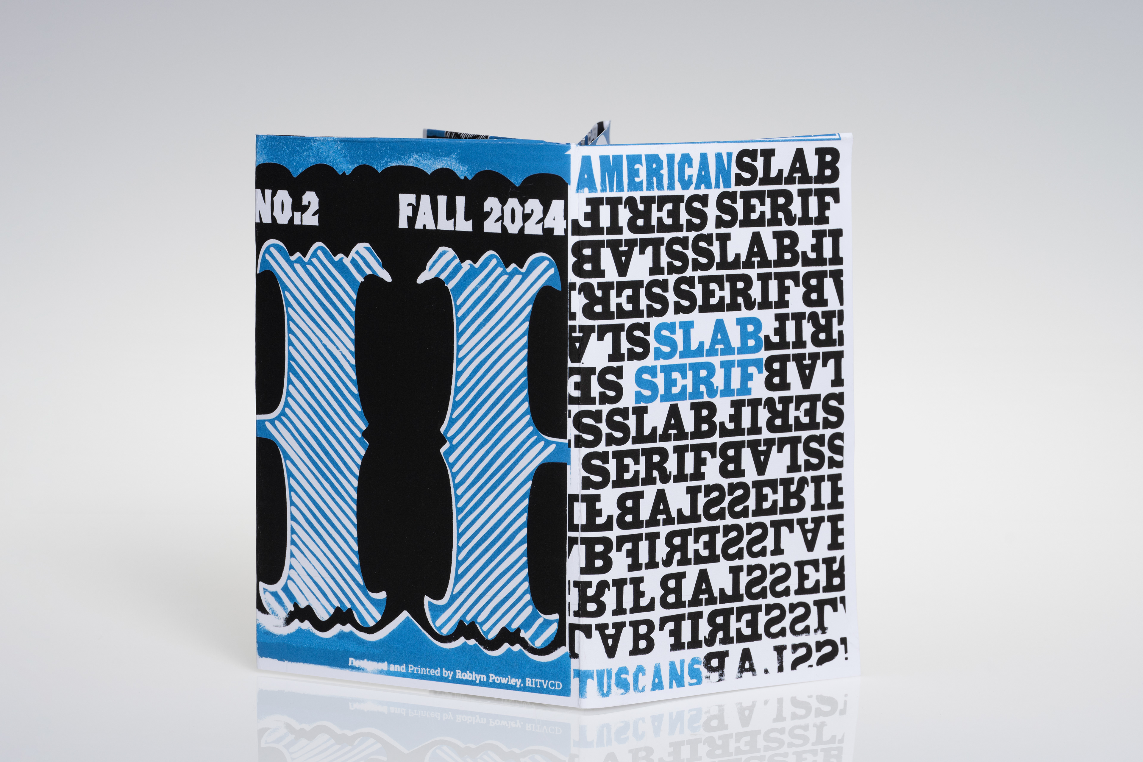
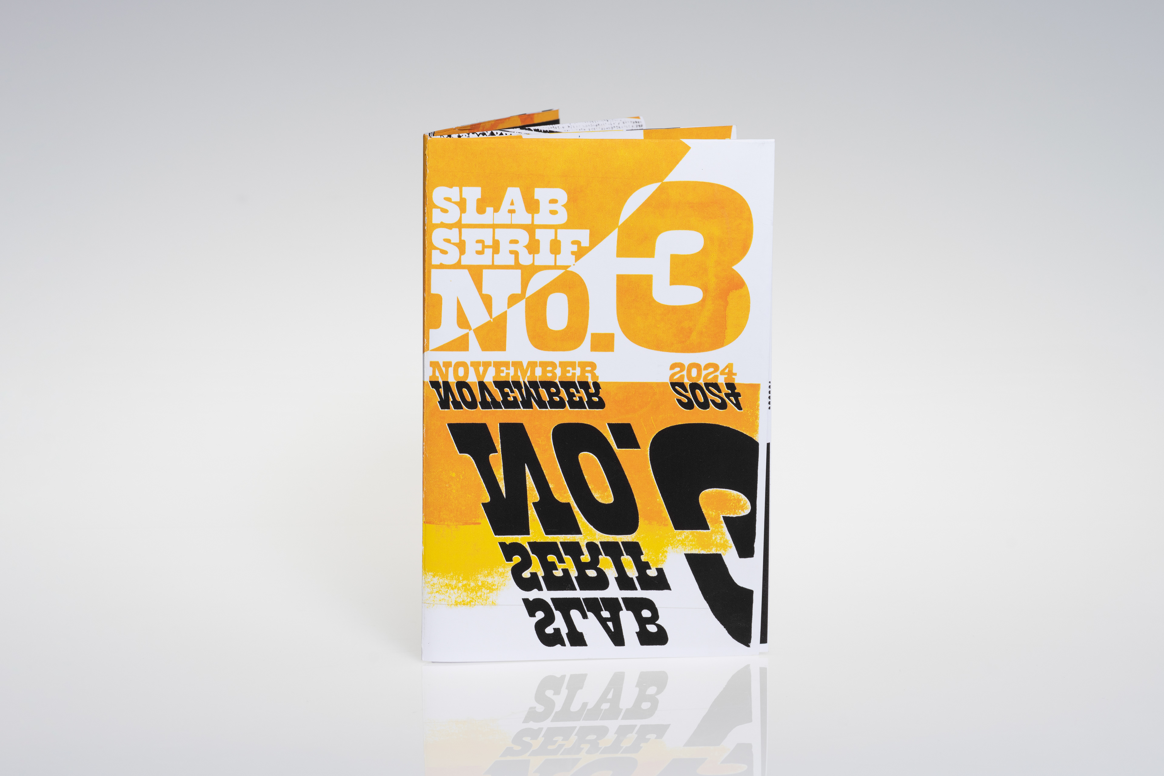
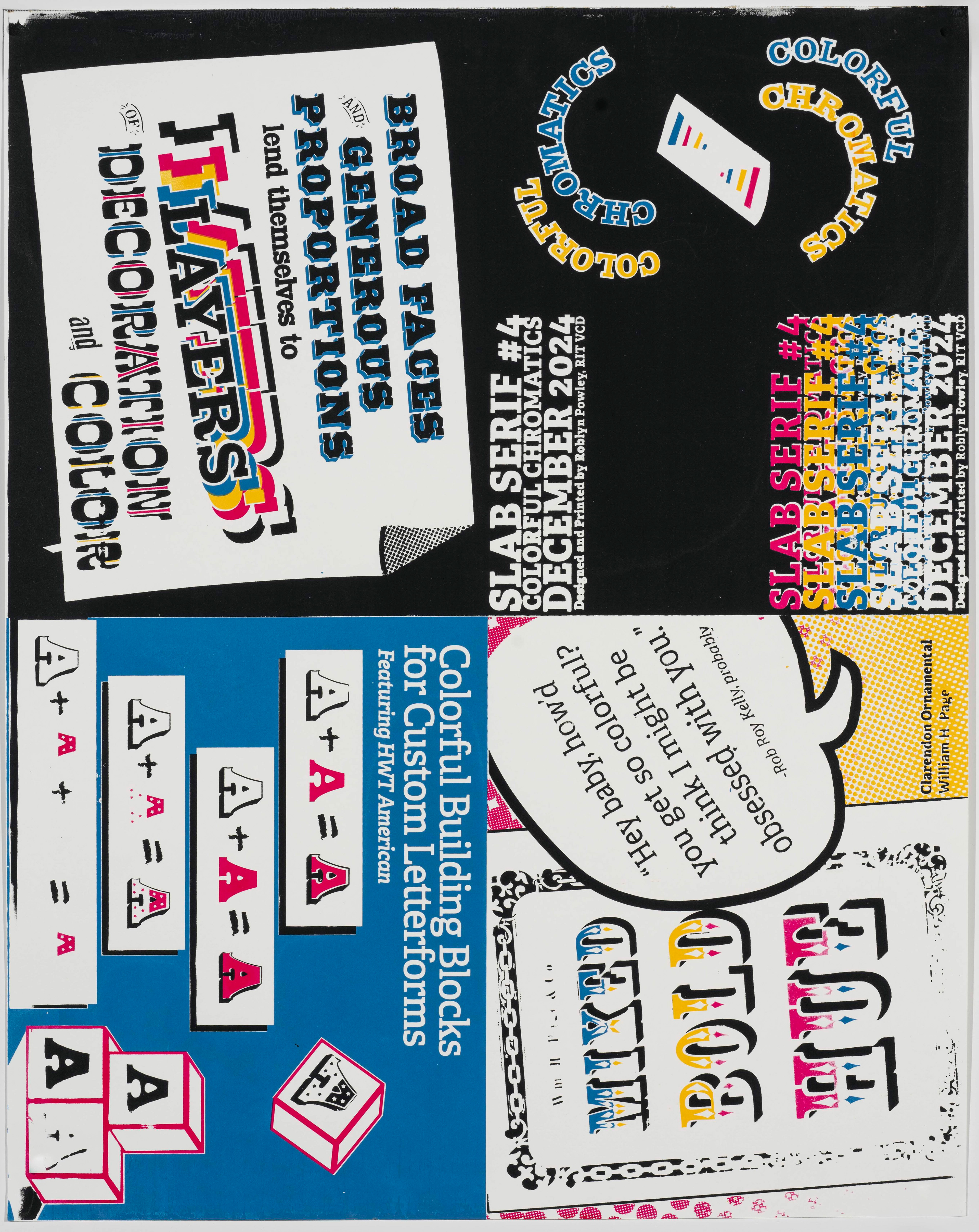
Each issue of Slab Serif is a single 18"x24" screen-printed composition, highlighting a specific topic related to Slab Serif typography: general characteristics of the slab serif, American
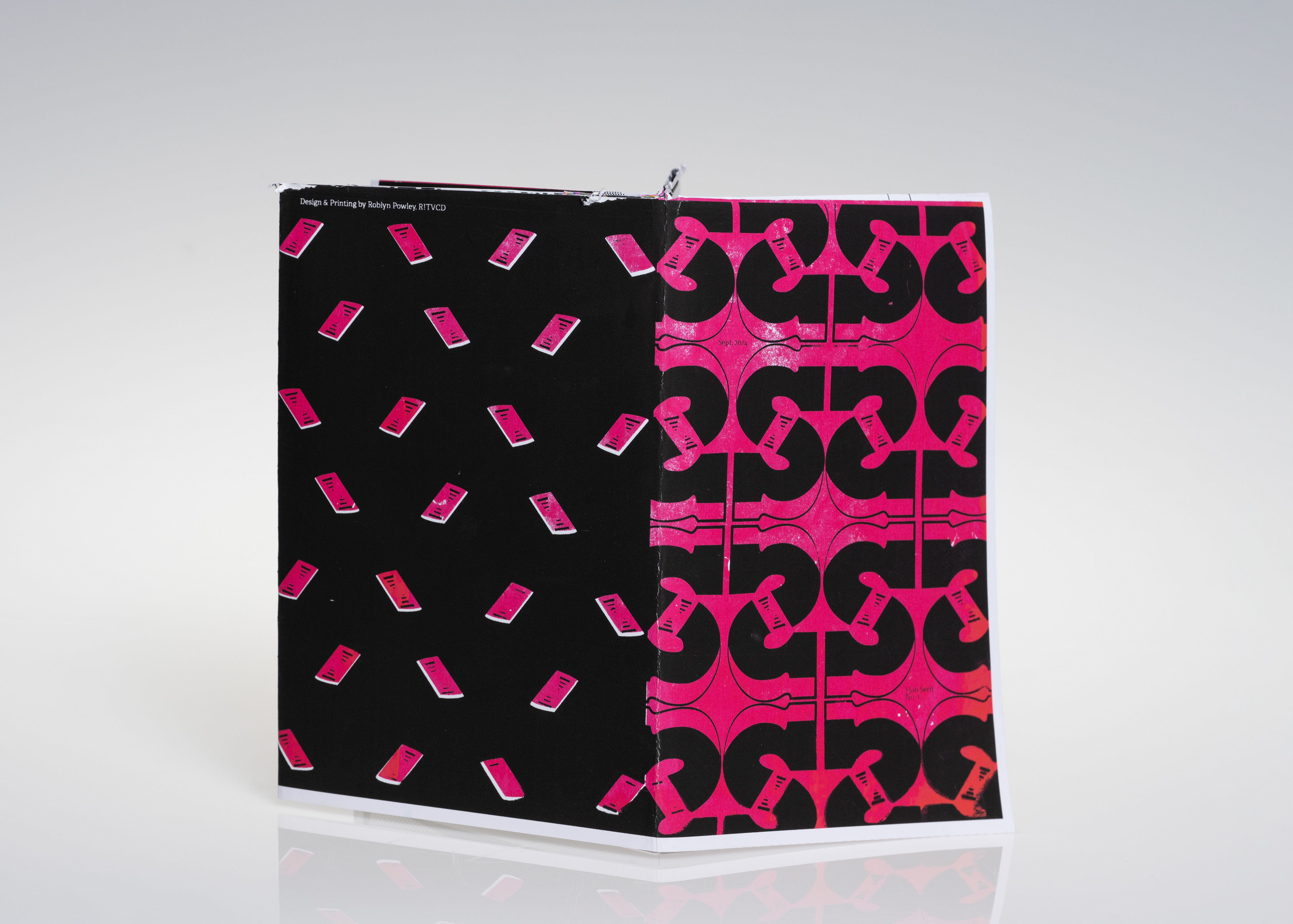
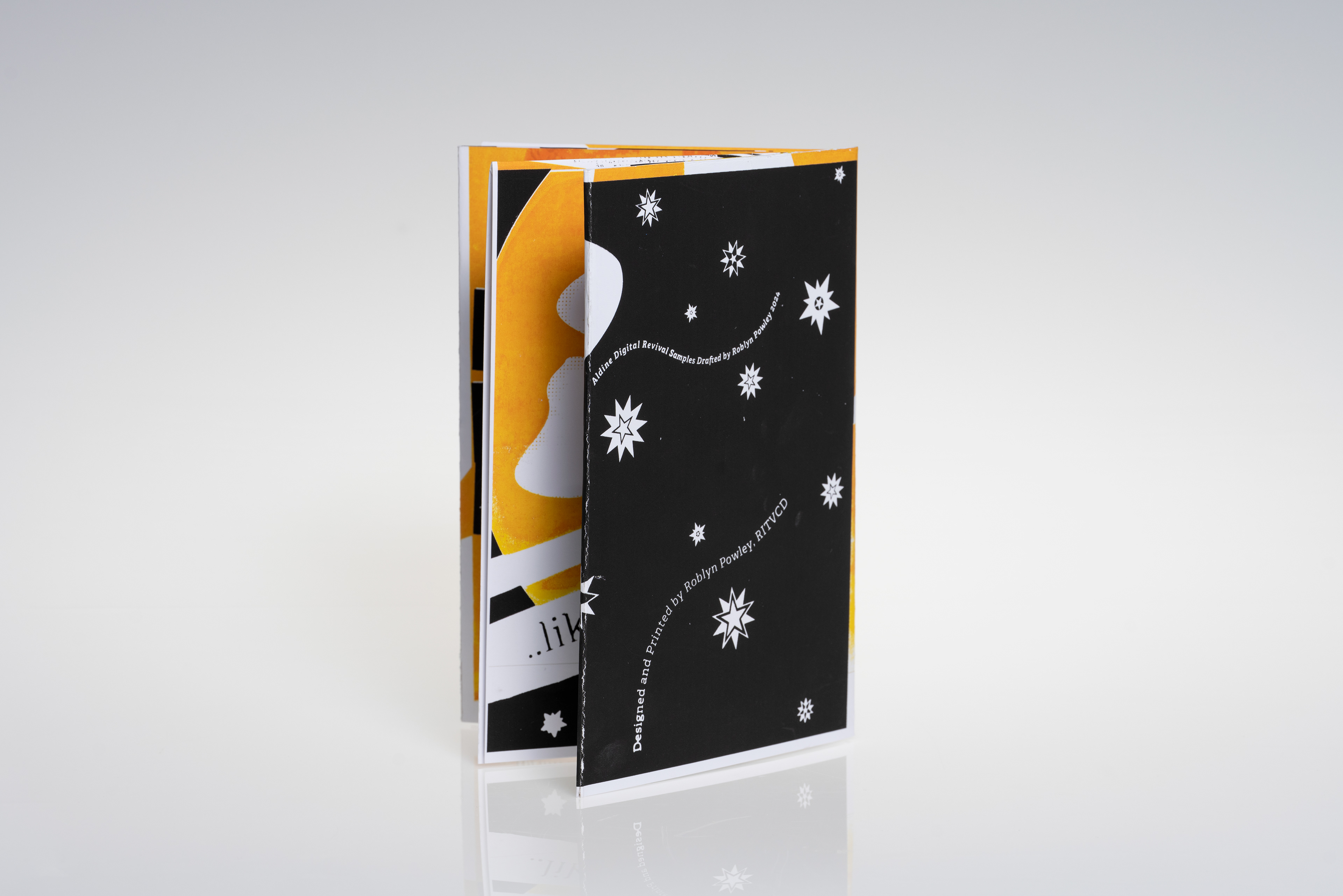
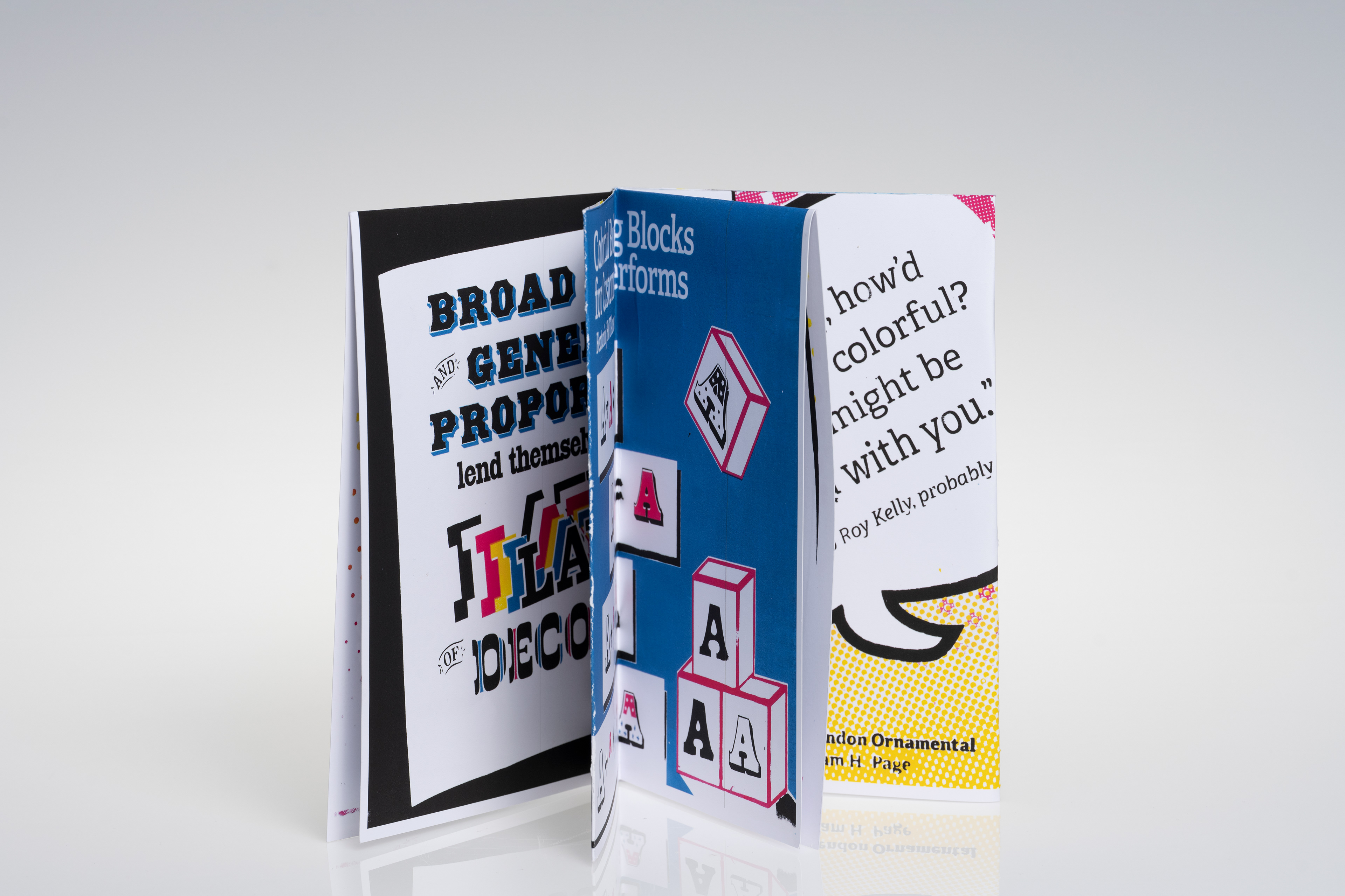
Tuscans, the typeface known as 'Aldine', and the multicolor chromatics. Each issue's printed, single-page composition is folded into an 8-page zine. Each issue also features a centerfold-
style poster on the reverse that can be viewed when the zine is unfolded.
This project is an exercise in contradiction: digital vs analog, slow vs fast, antique vs modern.
Embracing the ad-hoc, hand-made ethos of zine making, constrained by the nature of a slow production process. Pushing through the process of research, design, and production,
to create compositions that are simultaneously fresh and grounded in history.
The final work is—beyond anything else—a love letter to letterforms I love. It focuses
on concept, meaning, and emotion; pulling its identity from a multitude of inspiration
points through the last two centuries of typographic and print history.
of screen printing and zines.
Each issue of Slab Serif is a single 18"x24" screen-printed composition, highlighting a specific topic related to Slab Serif typography: general characteristics of the slab serif, American
Tuscans, the typeface known as 'Aldine', and the multicolor chromatics. Each issue's printed, single-page composition is folded into an 8-page zine. Each issue also features a centerfold-
style poster on the reverse that can be viewed when the zine is unfolded.
This project is an exercise in contradiction: digital vs analog, slow vs fast, antique vs modern.
Embracing the ad-hoc, hand-made ethos of zine making, constrained by the nature of a slow production process. Pushing through the process of research, design, and production,
to create compositions that are simultaneously fresh and grounded in history.
The final work is—beyond anything else—a love letter to letterforms I love. It focuses
on concept, meaning, and emotion; pulling its identity from a multitude of inspiration
points through the last two centuries of typographic and print history.

No. 1
The Slab Serif
The Slab Serif


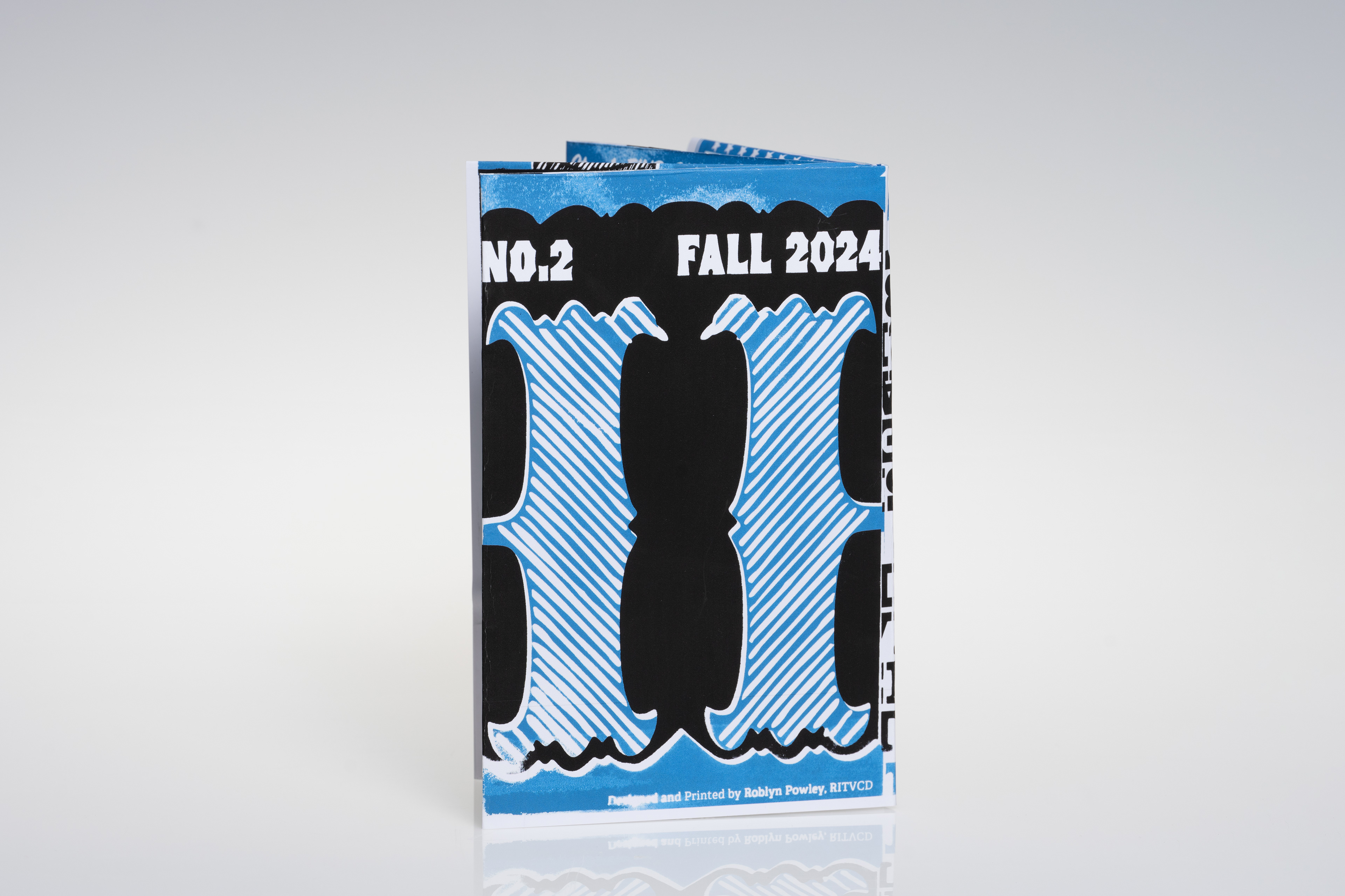
No. 2
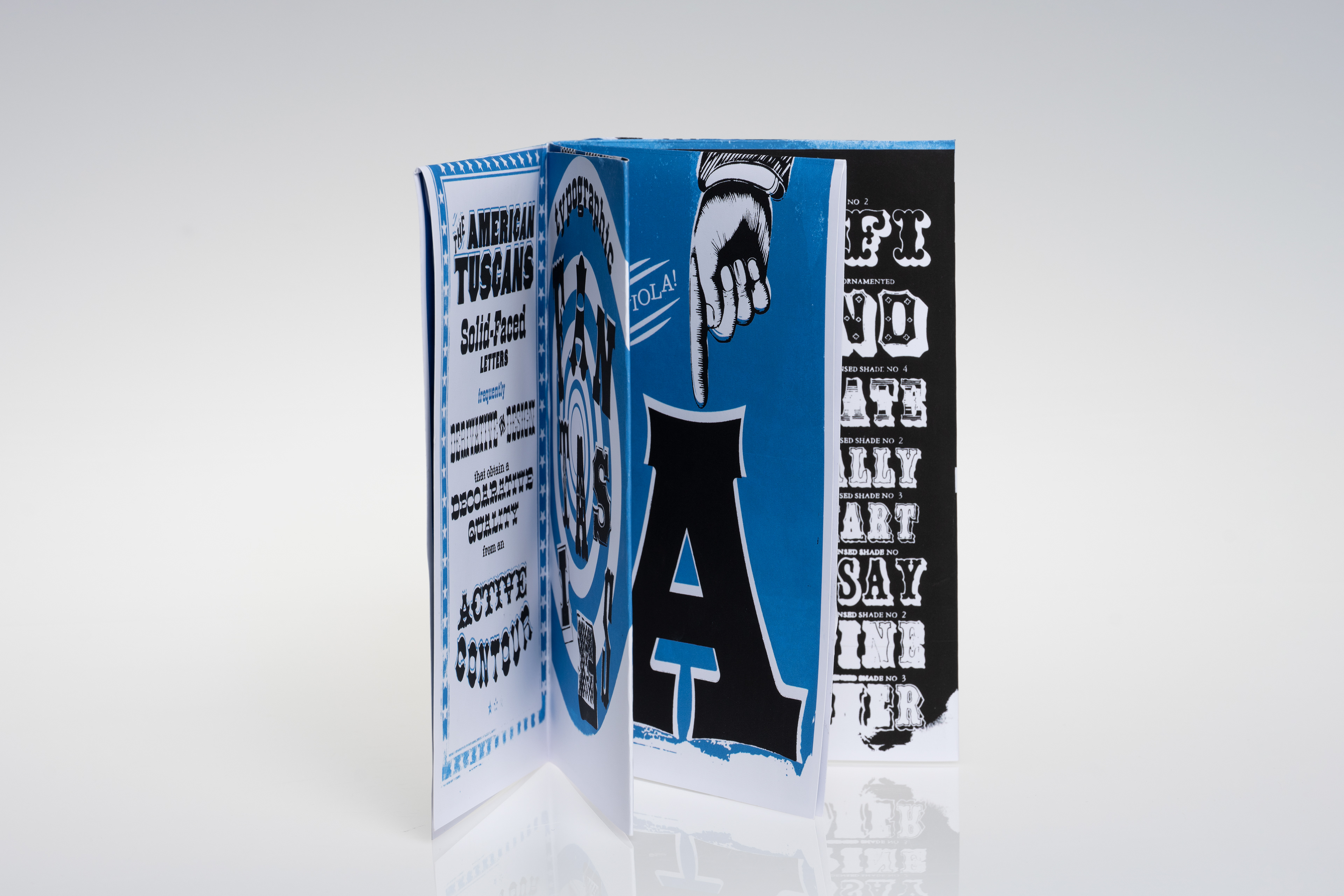
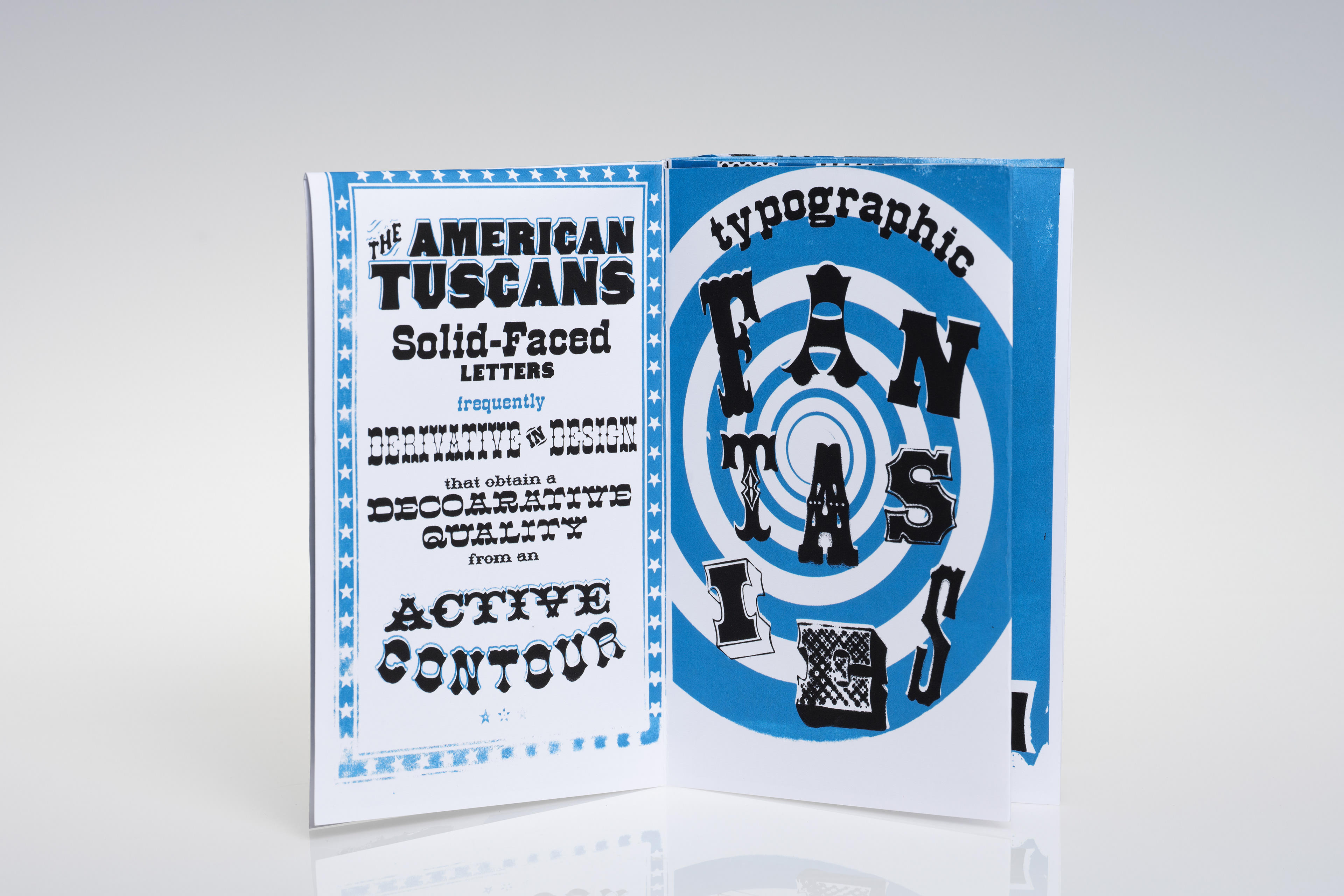
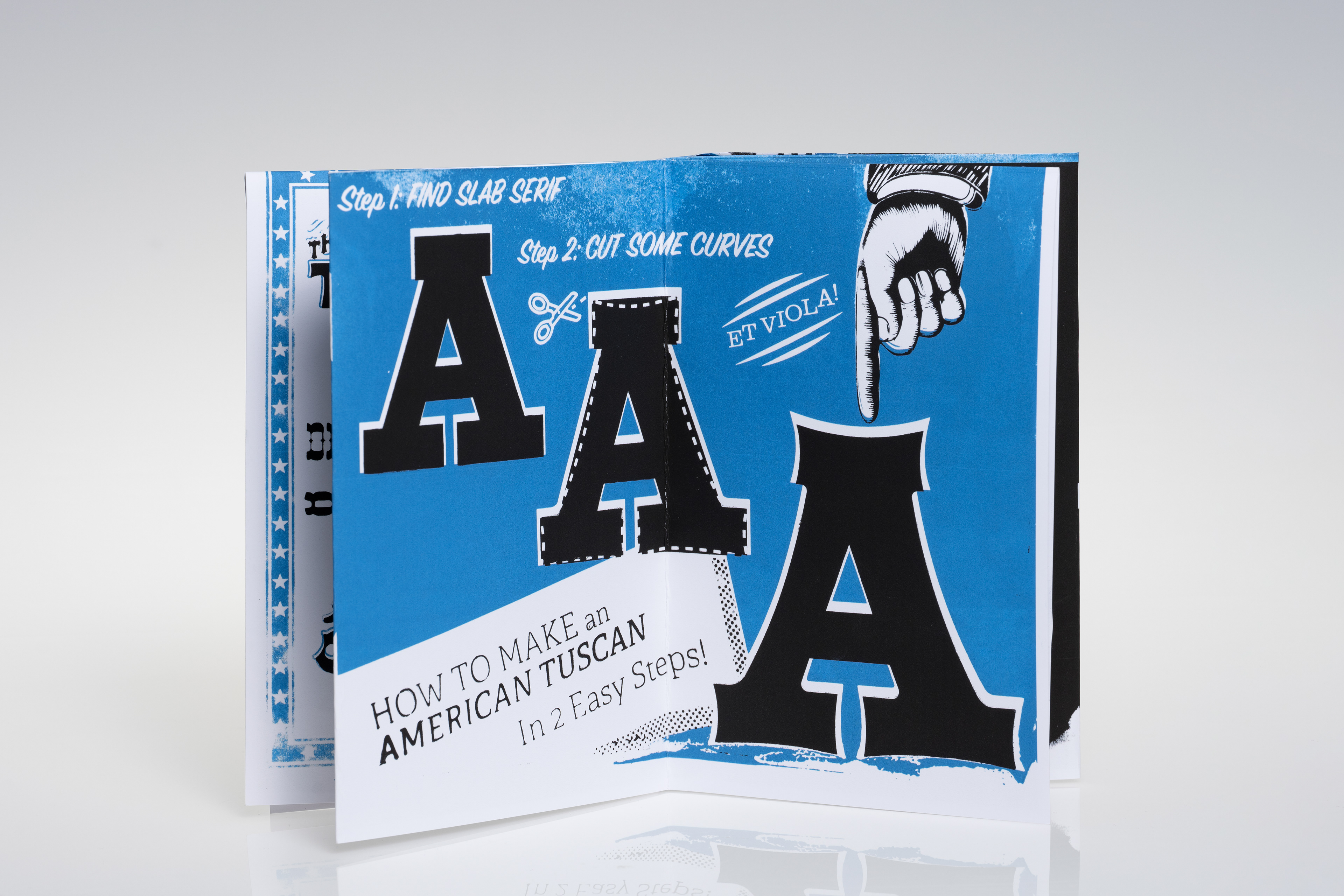
American Tuscans
American Tuscans

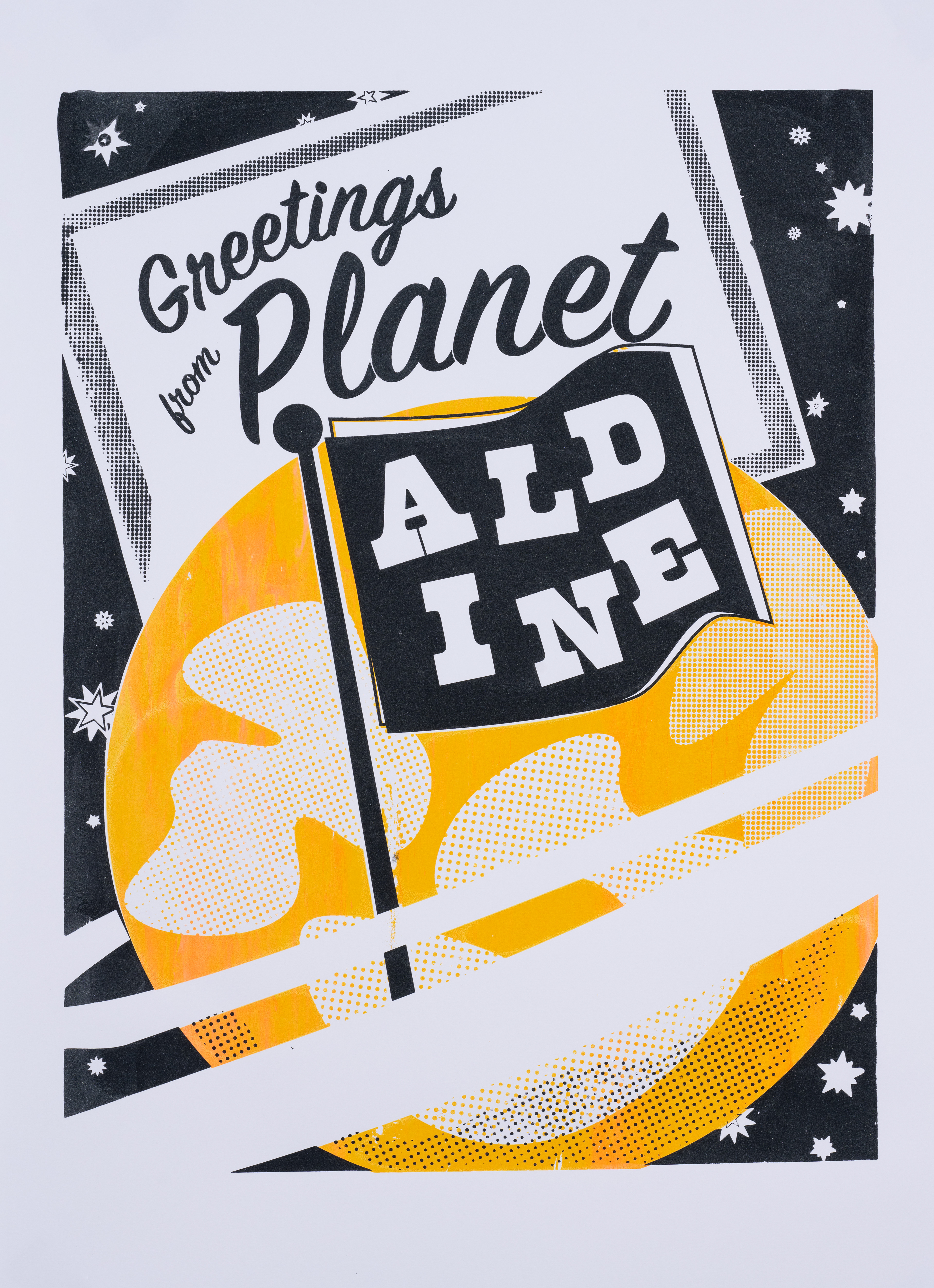
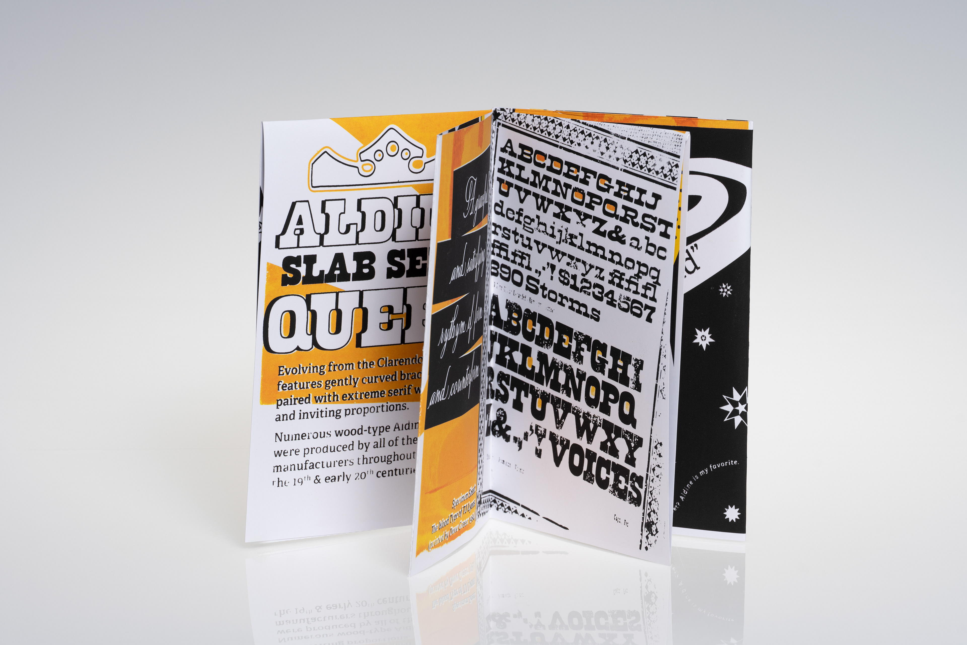
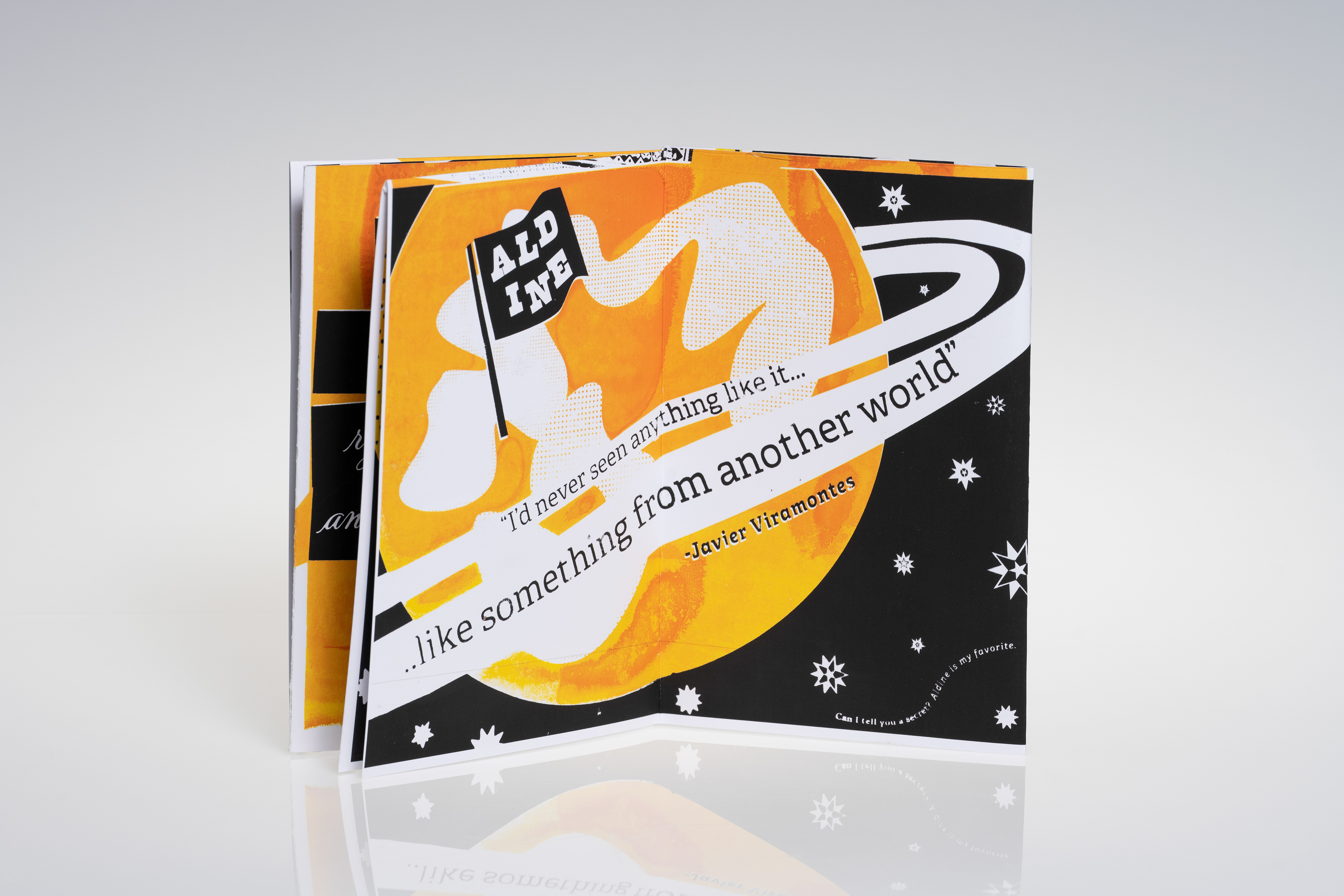
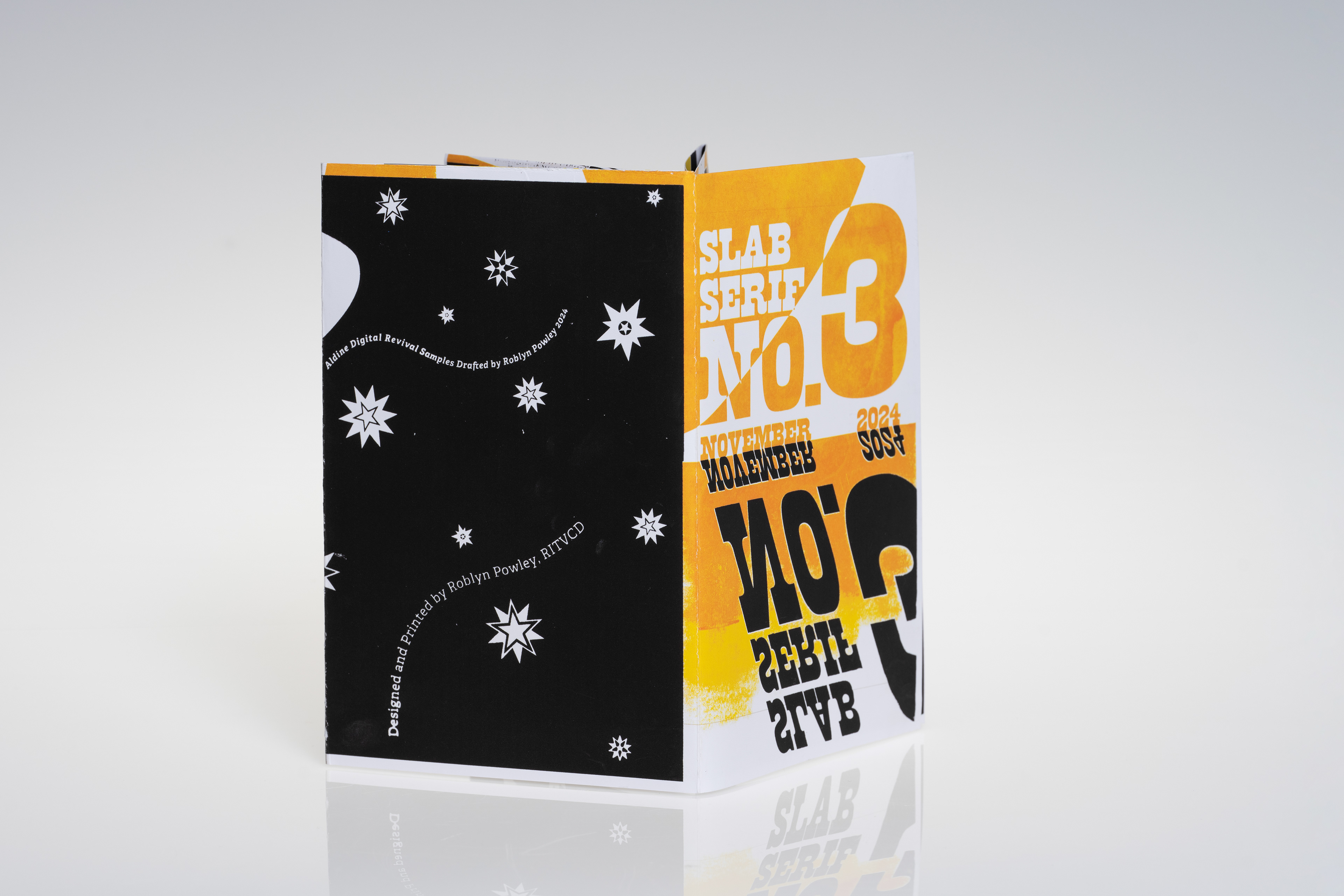
No. 3
Aldine
Aldine


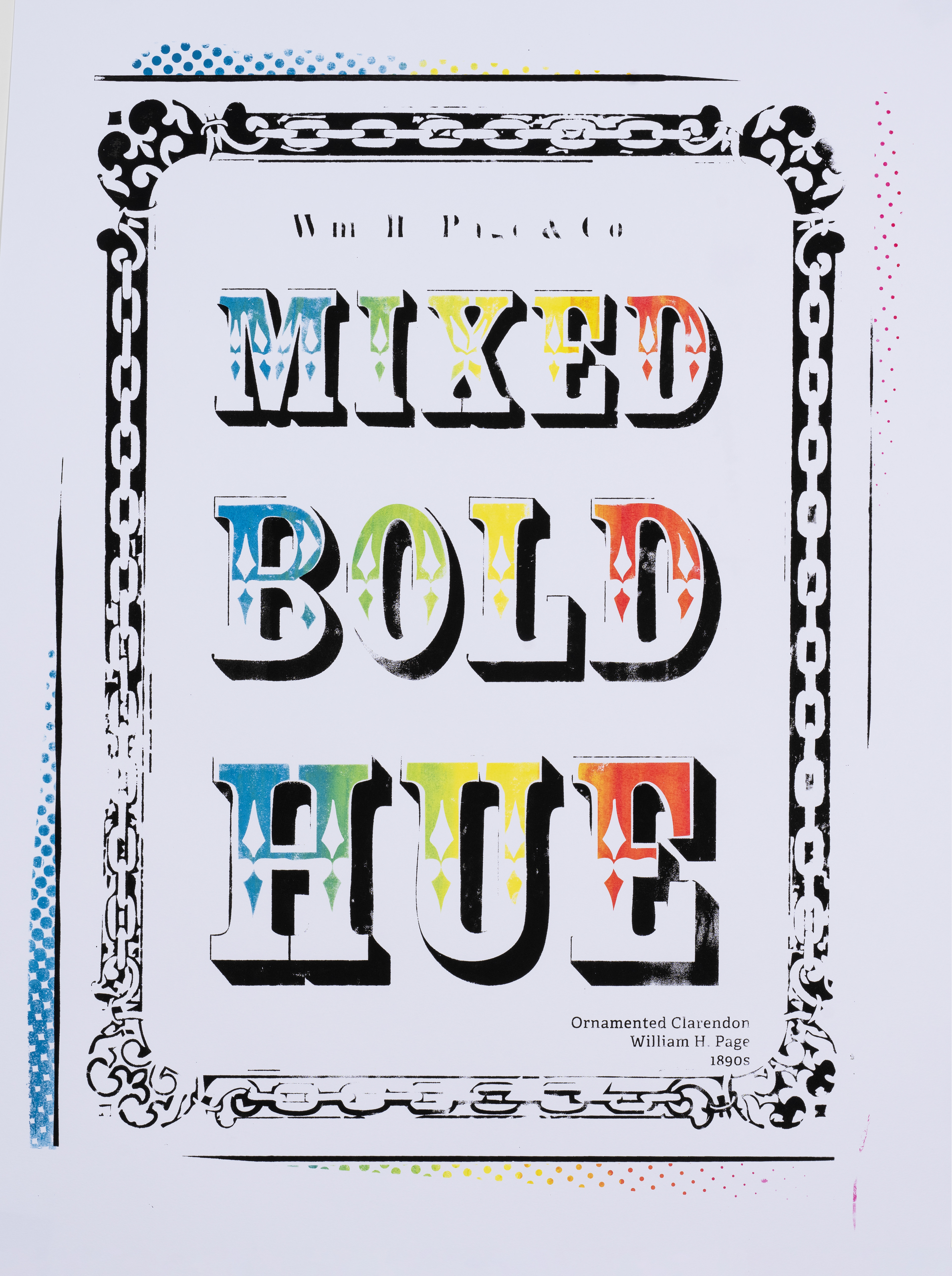
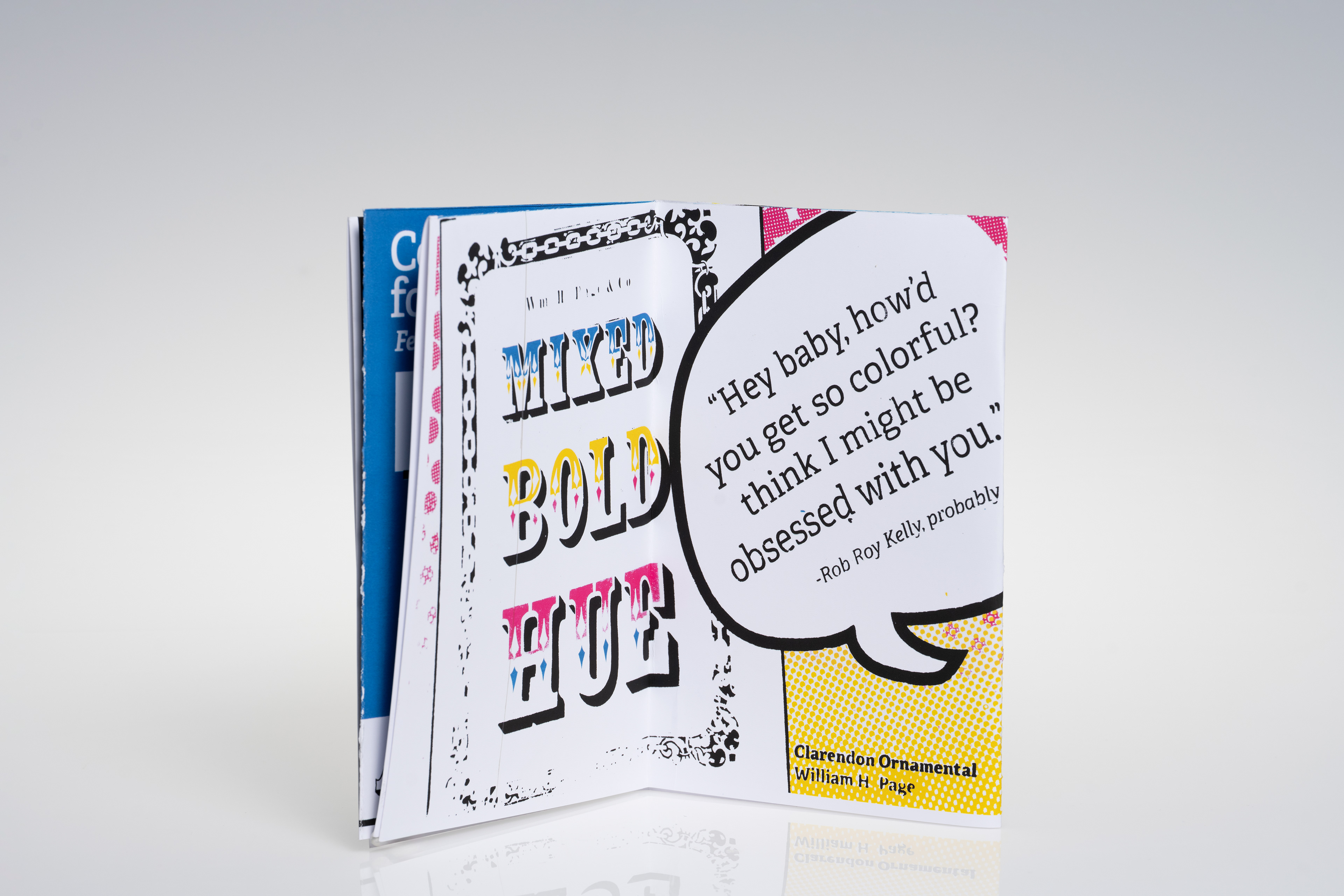
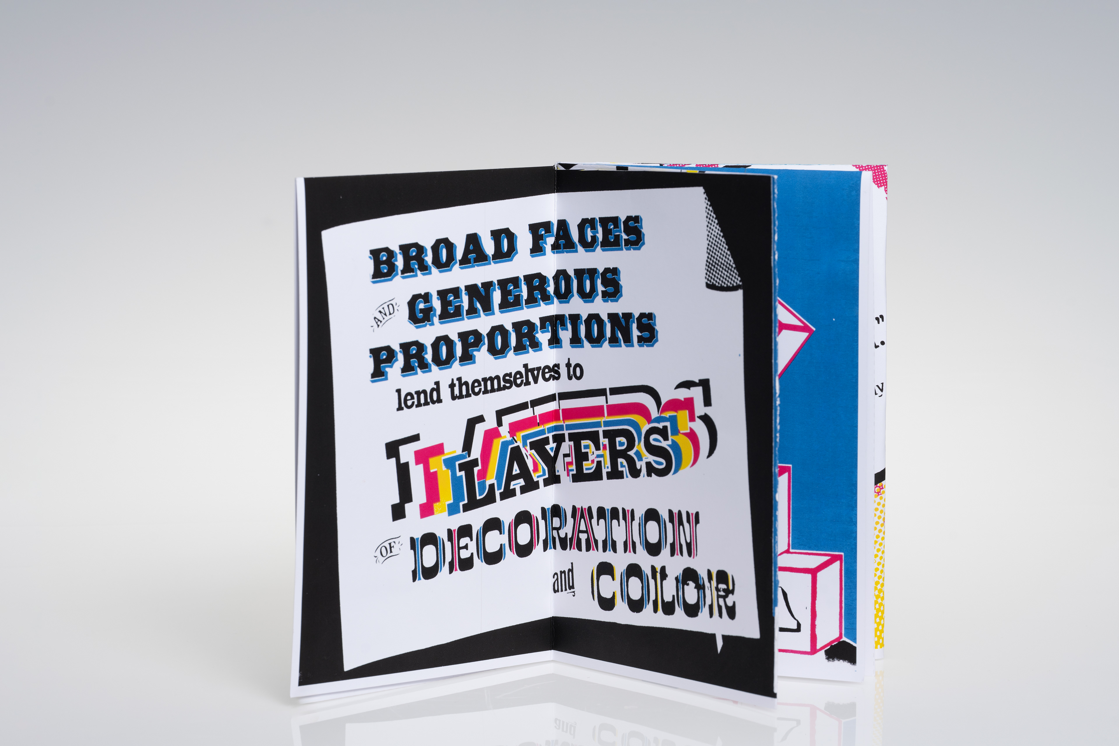
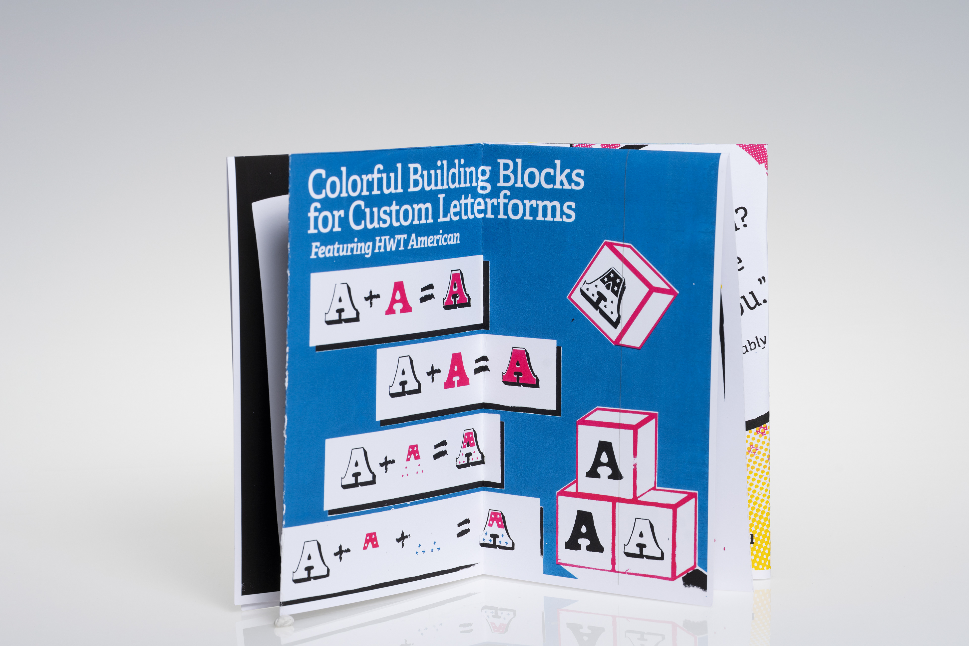
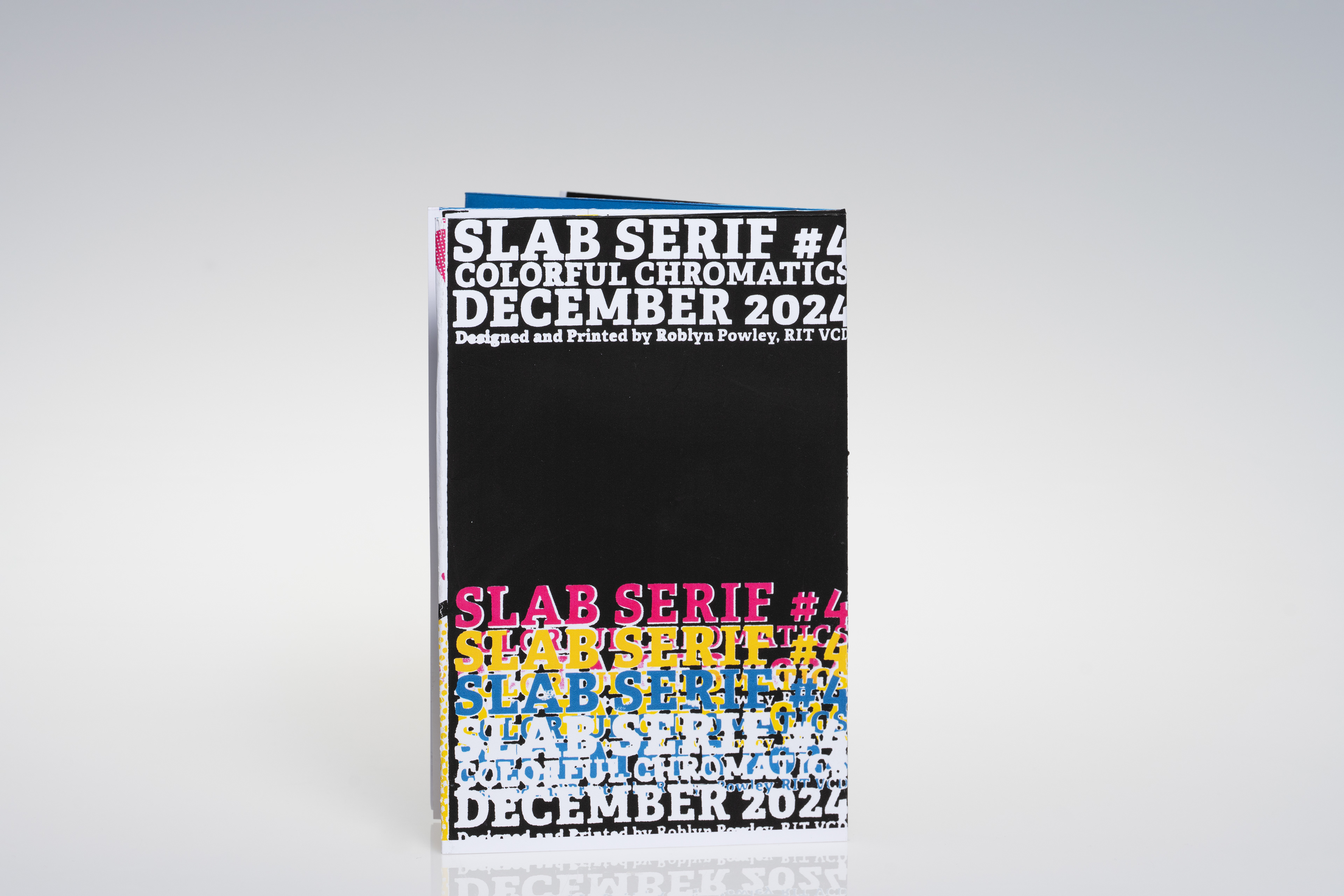
No. 4
Multi-Color Chromatics
Multi-Color Chromatics


Unfolding No. 3 in the studio: